Sign In or Create New Account

Remember me

Connect

The Story Board
Previous
Next
Sort Stories
Top Stories Most Recent
  |   Stories Main View   |   Stories I follow   |   Stories I've Shared   |   Favorite Stories   
 Title 
Title Author Description

Red Is...

I had to do a lot of thinking about this layout. I started to use yellow and use one of my grandchildren and say "You are my sunshine"  but that would not really fill the requirements to use multiple pictures of yellow things. So I looked around my house and I had mostly red!  Change in plans...I started just brainstorming a list of the things that I think of when I think of red. It's a powerful color - strong, bold, it can be angry...So then I started thinking about trying to make a page that was grafitti-ish. I'm not a huge fan of some of the scrapbooking you see that is what kind of just looks "messy" to me. So this was WAY outside my comfort zone!  I took some black paint and just stroked it on with a dry brush. OK background done!  I then took my words and printed them out and worked on distressing them. Step 2 done.  Now for the grid - I had decided I wanted to cut a portion out of the 12x12 grid and I started with 9x9 squares - not quite enough room for everything else to go! So I ended up with 8x8 squares and tilted it slightly askew. So here is the best of both worlds - "messy scrapbooking" combined with the order of mosaic!
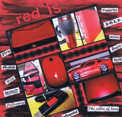
Shared by Nancy Sanders on May 13, 2012 | Memory Date: May 13, 2012
Follow Nancy Sanders
Cheer Me On
Love it ! 3
LOL! 0
Heartwarming! 0
Yummy! 0
Great Job! 1
Wow! 1
Beautiful! 0
Thnx 4 Sharing 0
Made Me Smile 0
Click an Expression to Cheer Me On.
Story Cheered By:
Comments
Nancy - Great layout! Like all the descriptive words for red. My husband's cars/trucks/boats are always red themed.
Posted By: Julie Oconnor  |  May 23, 2012 at 1:19 pm   
Wow! Totally out of the box creativity!! I feel a lot of "scraplifting" going on here!! Great job.
Posted By: Beth Glass  |  May 19, 2012 at 3:57 pm   
Red is...wild indeed! All the words you've used to describe red work perfectly with your layout. Another unique use for the 8x8 pages. And the photos really pop with the use of black. Great Job!
Posted By: Andrea Fisher  |  May 15, 2012 at 9:08 pm   
I love the way you distressed your background paper and offset the grid. This is very evocative of all of the feelings for the color red. Your creativity is totally inspiring, here!
Posted By: Deborah White  |  May 15, 2012 at 2:30 pm   
     

Terms of Use | Privacy Policy | Contact Us © 2024 Journella LLC

Help us Grow on Delisous Find us on Facebook Follow us on Twitter