2012 MMDT April Challenge #2
2012 MMDT April Challenge #2
Raspberry Grid Paper and Mosaic Moments pattern #10
 I am not a Bold and Bright color person by nature, but on occasion I can venture out of my comfort zone and try something new! By the time I was done, I loved it and bought more! The other elements of the challenge to include.
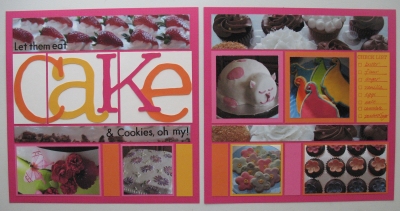
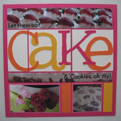
 I have an oversized title and a list for my elements. I also used a package of MM Paper Tiles in a new trio of colors-Watermelon Sensation, Pineapple Bliss, and Tangelo Bliss. I used pattern page #10, upside down.
 I used my Cricut to cut the letters for "cake" in colors matching the MM Paper Tiles trios mentioned above (from a pack of brights from Walmart), in the Doodletype font in a mixture of sizes and regular letters and caps. I made this a double layer to give it a little bit of depth. I mounted it on white to let those colors "pop". I used rub-on letters from Making Memories-"Destination", in small black for the rest of the title.
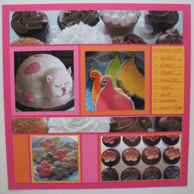
 My list is stamped in Magenta Versa Color, and the list stamps are Tami's own from CL 103 Scrap Friends by Impression Obsession. My list is written up with a fine point Sharpie pen.
This layout features some of the goodies that have come out of my daughter Hannah's bakery that happen to be a nice compliment to the Raspberry Mosaic Moments featured grid paper.
- Oversized Title
- Free Download
- A list
Shared by
Andrea Fisher
on April 23, 2012
| Memory Date: April 23, 2012
Cheer Me On
Story Cheered By:
Comments
Thanks to you all..and Amy Jo...while working in the "grids" Tami still has challenges getting us to think outside the "box"! I think we'd all agree it's really pushing us to be more creative and see just how versatile the MM grids are. I think it's time to see layouts that have been inspired by the challenges! Anyone in the cheer section have a page to share?
Posted By:
Andrea Fisher | May 1, 2012 at 12:53 am
I love the VERY oversized title and how you cut it! I also like the choice of yellow and orange to complement the pink background.
I think this is my favorite of the raspberry paper challenge...
Posted By:
Amy Jo Maruschak | April 30, 2012 at 10:57 pm
yeah, I NEVER would have thought of the raspberry with orange but it looks like a couple of you really made it work! And talk about a jumbo title!! Holy cow! great job!
Posted By:
Deborah White | April 30, 2012 at 4:15 pm
Andrea this page is way too YUMMY! I love the over-sized title! and the check list is a great addition.
Posted By:
Tami Potter | April 25, 2012 at 12:03 pm
love,love,love.....and NOW i understand all the posts on fuscia, hot pink, magenta....lol. great page layout and i agree....i want to eat e/thing on the page! i am still off sugar!!
Posted By:
Sheila Deptowicz | April 25, 2012 at 6:16 am
Your title is so eye catching! And I love your photos. Wonderful. Great idea to flip the page pattern upside to fit your plan, too.
Posted By:
Sarah Lewis | April 24, 2012 at 2:52 pm
Great choice of colors and the use of the pattern page upside down! Don't even get me started on how delicious the cakes look!! I am an absolute chocoholic!!
Posted By:
Beth Glass | April 24, 2012 at 2:30 pm
This one looks like a great magazine ad! I should have cheered "sweet," because the whole thing looks yummy. Your colors really look great together, and you took the oversized title challenge seriously. I LOVE it!
Posted By:
Linda Holmes | April 24, 2012 at 6:10 am
Very "sweet" page. Desserts look very enticing. Wish I could eat one!
Posted By:
Dale Hill | April 24, 2012 at 12:09 am


