Sign In or Create New Account

Remember me

Connect

The Story Board
Previous
Next
Sort Stories
Top Stories Most Recent
  |   Stories Main View   |   Stories I follow   |   Stories I've Shared   |   Favorite Stories   
 Title 
Title Author Description

Old Mill Park

The April design team challenge was to take some early morning photos. My challenge was to find a free early morning to get out of the house for a photo op! I had decided where I wanted to go for my picture taking and I was waiting for the right morning to arrive. Finally, my kids and my husband headed out the door around the same time on a Monday morn at 6:45, I quickly dressed and drove to the park. Unfortunately, the weather was not cooperating with my plans. Sunrise was at 6:50 that morning but the sun was hidden behind menacing gray clouds. The wind was blowing and it was cold!!! But I mustered on my mission. I was hoping to get more lights and shadows in my photos but the morning light was really flat. I did have a brisk stroll around the park and I was happy to finally get to my inviting seat heaters in my car!
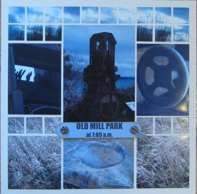
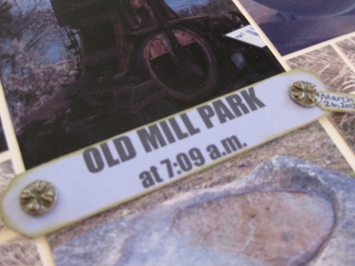
I based my page design off of Mosaic Moments page pattern #31. The page patterns are wonderful guides for helping with design ideas. I was stumped about how I wanted to best use my photos for this page and glancing through the page patterns was really helpful.

Shared by Sarah Lewis on April 7, 2012 | Memory Date: March 26, 2012
Follow Sarah Lewis
Cheer Me On
Love it ! 0
LOL! 0
Heartwarming! 0
Yummy! 0
Great Job! 0
Wow! 0
Beautiful! 1
Thnx 4 Sharing 0
Made Me Smile 0
Click an Expression to Cheer Me On.
Story Cheered By:
Comments
I like the clouds at the top and the earth at the bottom. I also second the comment that the colors work very nicely together.
Posted By: Deborah White  |  April 12, 2012 at 4:57 am   
Loved the placement of the photos and the sky across the top!
Posted By: Beth Glass  |  April 9, 2012 at 8:45 pm   
The whole effect is just beautiful. The colors of your photos blend together so well--sometimes shades of blues don't look good together. The page pattern you used was perfect for the pics. I second Andrea's comment about the top photo going completely across the top. The time tag is a great embellishment. Have you decided to go for a brisk walk every morning--ha!
Posted By: Linda Holmes  |  April 9, 2012 at 1:36 pm   
I think you must have chosen the perfect pattern for your photos - it looks so good! and I too love the title tag - and that you included the time!
Posted By: Tami Potter  |  April 8, 2012 at 4:35 pm   
Love your little date tag, so subtle! Like that you told us which MM pattern you used, too. Aren't the simple shapes like the "wheel" so great for giving light and dark contrasts? Like that you used your cloudy sky photo across the whole top. Summer may have brought warmer temps to deal with, but it would have been an earlier sunrise too!
Posted By: Andrea Fisher  |  April 7, 2012 at 11:11 pm   
     

Terms of Use | Privacy Policy | Contact Us © 2024 Journella LLC

Help us Grow on Delisous Find us on Facebook Follow us on Twitter