Sign In or Create New Account

Remember me

Connect

The Story Board
Previous
Next
Sort Stories
Top Stories Most Recent
  |   Stories Main View   |   Stories I follow   |   Stories I've Shared   |   Favorite Stories   
 Title 
Title Author Description

A Day at the Zoo

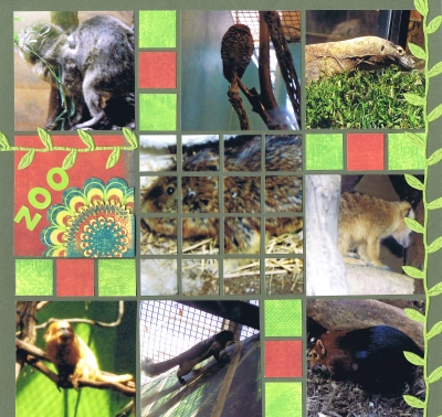
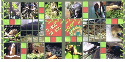
Our challenge this time was to either use the Plum Perfect Page kit or to use Page Pattern 3 with Cypress paper and either patterned paper, stamps or ribbon.  I loved the kit, but I didn't have any photos that I thought would look good with those colors, so I decided to go with the Cypress green grid paper.  I knew I would need several pictures, so I chose a set my daughter sent me of her family's trip to the zoo in Washington D.C. I wanted a bright page, so I chose some paper I had in my stash from Bo Bunny. I cut one of the motifs from the paper several times so I could stack the burst next to the title.  And then I had this great ribbon I got from Paper Wishes that looked like a vine - perfect for a zoo page!

To make the two page spread, I made a mirror image of the page pattern for the 2nd page:
 

Shared by Nancy Sanders on March 26, 2012 | Memory Date: June 18, 2011
Follow Nancy Sanders
Cheer Me On
Love it ! 0
LOL! 0
Heartwarming! 0
Yummy! 0
Great Job! 3
Wow! 1
Beautiful! 0
Thnx 4 Sharing 0
Made Me Smile 0
Click an Expression to Cheer Me On.
Story Cheered By:
Comments
I won't repeat all the comments above that I agree with but will just say, great job!!
Posted By: Beth Glass  |  March 30, 2012 at 3:17 pm   
I love the vine ribbon and your mirror image layout. Looks like it was a fun day at the zoo. The colors you choose are really vibrant and eye catching.
Posted By: Sarah Lewis  |  March 27, 2012 at 3:03 pm   
Nancy, I wish you had a close up on your title with the burst to see the details of all the stacking you did for it, great idea! Your vine ribbon is a nice addition working well for the theme in the layout. Don't you just love when something you've had for a while it just the right thing for a page?
Posted By: Andrea Fisher  |  March 26, 2012 at 7:12 pm   
I really like the colors and the way you did the mirror image. The vine ribbon looks great. I used some of the same ribbon on mine last week, but we were leaving on vacation, and after two wasted hours, I could never get the pictures to download and forward. Grrrrrrrr!
Posted By: Linda Holmes  |  March 26, 2012 at 6:44 pm   
I like the colors and the way the vine feeds into the wild/zoo theme. I think my favorite part is the "twist" you did where you used mosaic cuts for the center pics.
Posted By: Deborah White  |  March 26, 2012 at 5:17 pm   
Nancy, I love how you used the mirror image of the page pattern for the second page and put the two blocks together to make the title. I also love the mosaic detailing. Wonderful job. :)
Posted By: Tami Potter  |  March 26, 2012 at 4:52 pm   
     

Terms of Use | Privacy Policy | Contact Us © 2024 Journella LLC

Help us Grow on Delisous Find us on Facebook Follow us on Twitter