Sign In or Create New Account

Remember me

Connect

The Story Board
Previous
Next
Sort Stories
Top Stories Most Recent
  |   Stories Main View   |   Stories I follow   |   Stories I've Shared   |   Favorite Stories   
 Title 
Title Author Description

Hear The Music

We were given 2 design options for the 2nd March Design Team project: use a Page Pattern 3 or the Plum Perfect page kit from Mosaic Moments. I love to use the page kits that Tami Potter has designed, so I lept at the opportunity to use one for my project.
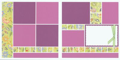
We were asked to add a twist or two to the page kit to make it our own. I decided to use the kit in it's original orientation since that is how my photos best fit.

My photos had quite a bit of red in them. At first, I did not think they were going to work with the Plum Perfect kit but I noticed there were a few red hearts on the accent paper. I thought "Why not add more red to the accent paper so it would better match my photos". I grabbed my trusty BIC marker and started coloring and adding lots of extra red accents.

I also wanted to add something extra to the purple accent strips. I remembered that I recently purchased a music themed stamp set. I dug that out of the cupboard and stamped a border along the strips.

To finish off my page, I pulled out the Cricut and cut out a title to fill the one remaining photo block. And I ran the journaling block through my printer to add those important details about the event.  Page kits are wonderful! You can quickly put a layout together with them but you can also make them your our with a few extra touches.

Shared by Sarah Lewis on March 25, 2012 | Memory Date: June 6, 2011
Follow Sarah Lewis
Cheer Me On
Love it ! 1
LOL! 0
Heartwarming! 0
Yummy! 0
Great Job! 5
Wow! 0
Beautiful! 0
Thnx 4 Sharing 0
Made Me Smile 0
Click an Expression to Cheer Me On.
Story Cheered By:
Comments
Love the layout! It reminds me of when my son was in band. If you watch their feet they tap to keep time.
Posted By: Julie Oconnor  |  April 1, 2012 at 3:25 pm   
Changing the kit seemed intimidating to me but you did a great job by adding red to the pattern paper to match your photos and stamping the music notes on the bottom border. I love how you did the title also!
Posted By: Beth Glass  |  March 30, 2012 at 3:23 pm   
I love the way you adapted the kit to your pics by adding the red to the patterned paper. The title and the musical stamped elements finish off a great layout! I also used the kit, but I haven't been able to forward--computer issues at home. Now we are on vacation in Florida, and I'm going to try again today here at the resort. I think I need everyone's prayers--Ha!
Posted By: Linda Holmes  |  March 26, 2012 at 7:08 pm   
A great way to add life to those kinda boring band pics!
Posted By: Diane Williams  |  March 26, 2012 at 3:06 pm   
I love that you added more red hearts - and the music border is wonderful Sarah. Your title is great and I love how you included the date down the side (next to the ribbon) of the journal block.
Posted By: Tami Potter  |  March 25, 2012 at 3:56 pm   
What a great idea to change the patterned paper to add more of the red - I don't know that I would have thought to do that! I'll have to keep that in mind for future projects!
Posted By: Nancy Sanders  |  March 25, 2012 at 3:08 pm   
I love the title...so great! What an ingenious way to add red to the patterned paper to match the reds in your layout!
Posted By: Andrea Fisher  |  March 25, 2012 at 3:26 am   
     

Terms of Use | Privacy Policy | Contact Us © 2024 Journella LLC

Help us Grow on Delisous Find us on Facebook Follow us on Twitter