Sign In or Create New Account

Remember me

Connect

The Story Board
Previous
Next
Sort Stories
Top Stories Most Recent
  |   Stories Main View   |   Stories I follow   |   Stories I've Shared   |   Favorite Stories   
 Title 
Title Author Description

Tribute to My Town

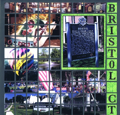
Our first assignment for March was to take pictures of our neighborhood and create a mosaic layout. Well, at this time of year in Connecticut, there's not much to look at except slush, mud puddles and sticks. Even wildlife is hard to come by!  For a brief moment, I considered a page showing the devastation to all my neighbors' yards - almost every one has a pile of branches to be cleared, and stumps where there were trees before our big storm in October. I decided that would be interesting, but just a tad too depressing!   So I decided to use pictures of my town , Bristol, and the things it is known for: the Watch and Clock Museum, the Carousel Museum, ESPN, balloon festivals and the Chrysanthemum Festival. Enjoy! What is your hometown known for?

Shared by Nancy Sanders on March 8, 2012 | Memory Date: March 8, 2012
Follow Nancy Sanders
Cheer Me On
Love it ! 2
LOL! 0
Heartwarming! 0
Yummy! 0
Great Job! 5
Wow! 1
Beautiful! 0
Thnx 4 Sharing 0
Made Me Smile 0
Click an Expression to Cheer Me On.
Story Cheered By:
Comments
After seeing this challenge to scrap your hometown, I thought about all of the pics I have of my hometown - somewhere in my scrap room...we are packing and eventually will be moving into a smaller place and lots of my stuff is "somewhere"; but as soon as we get settled, I want to do this!!! Thanks for sharing!
Posted By: Barbara London  |  March 21, 2012 at 12:41 pm   
By looking at your layout you would think it's beautiful in Bristol year round - just leave out the slush and mud puddles. Great job!
Posted By: Julie Oconnor  |  March 16, 2012 at 12:03 am   
What a great way to show us your town! I love the way you carried the light green behind the town sign. Great job!
Posted By: Rose Van Cleave  |  March 15, 2012 at 3:56 am   
Love how you did mostly 1" squares except for the Bristol sign which pops off the page. Looks like a really nice town!
Posted By: Beth Glass  |  March 13, 2012 at 1:27 am   
Bright and Bold colors brings so much life to the layout, I wish I could zoom in to see all the details! Love balloon races...we used to have them here too, so fun. Love the clocks at the top!
Posted By: Andrea Fisher  |  March 12, 2012 at 4:07 pm   
The top row is my favorite part--great idea! I had the same problems you did so took new pics all over our downtown. Hope you like it when I get it submitted. We have always said we are going to visit New England but haven't. Now I really want to. Maybe next fall.
Posted By: Linda Holmes  |  March 12, 2012 at 4:29 am   
Love the pop of color in the title and the way this really shows off the town's highlights. Being a New Englander, I've been to CT but not to Bristol. I may have to correct that oversight! Nice job.
Posted By: Libby Wiers  |  March 12, 2012 at 2:29 am   
Bristol looks like a lovely place to live!
Posted By: Tami Potter  |  March 9, 2012 at 12:05 pm   
I love the accent color you choose for your alpha tiles--they really pop off of the page. And the photos you selected to showcase your town are wonderful. The clock museum looks so intriguing and the carousel horse close up is great.
Posted By: Sarah Lewis  |  March 9, 2012 at 6:07 am   
     

Terms of Use | Privacy Policy | Contact Us © 2024 Journella LLC

Help us Grow on Delisous Find us on Facebook Follow us on Twitter