Sign In or Create New Account

Remember me

Connect

The Story Board
Previous
Next
Sort Stories
Top Stories Most Recent
  |   Stories Main View   |   Stories I follow   |   Stories I've Shared   |   Favorite Stories   
 Title 
Title Author Description

2012 Winter

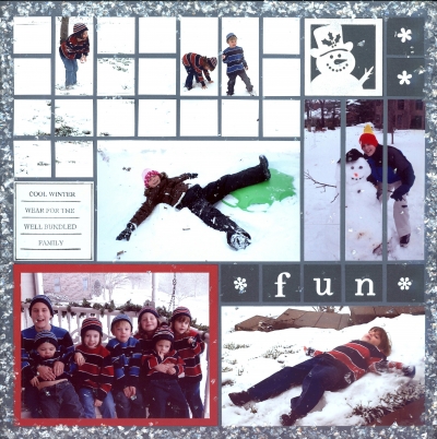
Using pewter grid paper, I created a 2-page layout depicting my favorite signs of winter--and they all started, for some reason with the letter S.  For the letters and numbers, I used off-white glitter stickers mounted on charcoal grey 1" squares.  The embellishments were:  a white snowflake striplet and a white snowman CornerStone (they were a little too white, so I lightly rubbed on grey ink.).  They were also mounted on charcoal cardstock.   "COOL WINTER WEAR FOR THE WELL BUNDLED FAMILY" was a Tami stamp (black), and I outlined the off-white block.  I matted the picture of the grandchildren on red, because I wanted it to be the main focal point.   To set off the entire layout, I randomly applied a clear matte glue to the   the outside edges and sprinkled on Mica Flakes.  Some of them stayed on the pics and resulted in a great "snowy" look overall (hard to see in the example, but looks much more like snow than glitter would).

Shared by Linda Holmes on January 9, 2012 | Memory Date: January 8, 2012
Follow Linda Holmes
Cheer Me On
Love it ! 19
LOL! 0
Heartwarming! 2
Yummy! 0
Great Job! 0
Wow! 0
Beautiful! 0
Thnx 4 Sharing 0
Made Me Smile 0
Click an Expression to Cheer Me On.
Story Cheered By:
Comments
Your layout is awesome, Linda! You are such an inspiration to us "beginners." You have such enthusiasm about your work.
Posted By: Judy Payne  |  May 10, 2012 at 10:15 pm   
Your house looks beautiful in the snow. The kids look like they're having so much fun!
Posted By: Georgia Bizal  |  March 21, 2012 at 12:23 am   
wow- the snow effect is totally awesome!! Plus - the way you displayed your layouts is really nice. The close view is definitely the way to go in the future.
Posted By: Deborah White  |  January 11, 2012 at 8:26 pm   
Linda you did a great job! Nice idea w/the mica flakes. Think there will be some scrap lifting with this one.
Posted By: Julie Oconnor  |  January 10, 2012 at 1:37 am   
Linda, I love your lay out! Great to see you on here. I am so proud of you!!! Congratulations on being a part of the Design Team!!!!
Posted By: Brenda Eaves  |  January 10, 2012 at 1:10 am   
AWESOME page, I LOVE IT ! I really like the red mat,and the snowman cornerstone.I really like that there is handwritten journelling on it,and the snowflake strip is a perfect addition, 3 cheers for Linda !
Posted By: Donna Bossone  |  January 9, 2012 at 10:13 pm   
Linda - You did an awesome layout. Love it! I especially love page 2 with the kids in strips and 1x1 around them. I could go on and on about all that I love about all of it. I am quite new and this is one I definately will copy (I have snow also - and grandkids). Thanks for sharing!
Posted By: Barbara Burger  |  January 9, 2012 at 6:50 pm   
I love the mica flakes around the edges of your pages--what a neat effect. And I really like how you cut the strips of photos around the kids and did mosaic 1x1 blocks with the rest of the snow scene.
Posted By: Sarah Lewis  |  January 9, 2012 at 3:54 pm   
I really love snow scenes and especially liked how you highlighted the focal picture with red mat. This will be a great layout to copy...
Posted By: Libby Wiers  |  January 9, 2012 at 3:38 pm   
Your choice of pewter is so perfect, it really works well for the winter theme. I REALLY like the cutting on page 2 top with the grandkids in the snow, making their individual block a whole section, while everything around it is still in single blocks, really helps to draw you in. (and just between you and I...I think we were all nervous about our debute presentation)
Posted By: Andrea Fisher  |  January 9, 2012 at 3:25 pm   
     

Terms of Use | Privacy Policy | Contact Us © 2024 Journella LLC

Help us Grow on Delisous Find us on Facebook Follow us on Twitter