Minnesota the Beautiful!
 WELL.... are you ready for a story?!
This 4th of July my husband and I went camping with family. We left on the 2nd and got back on the 6th. As we were FAR up north (very close to Canada), and out in the wilderness, we didn't have the traditional 4th of July...no fireworks, flags, parades, etc. But, we did have the beauty of nature!
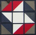
Now, moving on to the layout... This past weekend, I went on a hosted retreat weekend to Augusta, WI, with 2 friends. There were 4 ladies my friend Sharon and I had been on a hosted retreat with last fall. The other ladies were all gals we didn't know, and ALL quilters (including the gals from last year)!!!! The three of us were the only scrapbookers! I wasn't really sure what I wanted to do with no traditional 4th of July photos, but I remembered Andrea's America the Beautiful layout and thought I could do something highlighting "Minnesota the Beautiful". I knew what photos I wanted to use, just wasn't sure how to incorporate stars and stripes. With all of the quilters around, I also remembered layouts others had done inspired by quilt patterns. So, I googled stars and stripes on Pinterest and lo and behold.... this quilt pattern! 
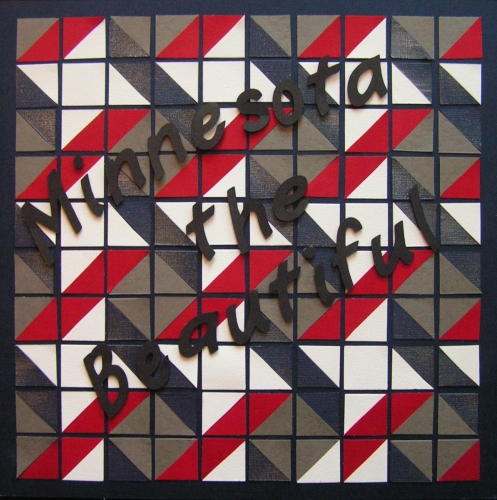
Right then I decided to draw out the pattern on grid paper, and do this design. Of course, when I packed for the weekend, I decided to leave my tiles and corners at home....I thought "if I need one, I can cut it out" and just took my 1" punch with me. Needless to say, punching out all of these squares, and then cutting all but 9 of them in half, was a project in and of itself!! The piecing them together onto the grid paper took me several hours....pretty much one afternoon/evening! I had intended to put photos on the page, but when it was done, the gals were shocked that I would cover it up! And, after all of the work that went into it, I just couldn't do it anyway! So, that page became my title page! I cut out the letters on the Cricut, mounted them with pop dots to show the pattern underneath, and that was it! Several of the quilters took pictures of my page at the retreat! Made me feel good! Here is page one!

I used Navy grid paper, and red, white, navy and gray cardstock for the pattern. I sprayed the navy with a glitter spray to give it more texture and incorporate the glitter embellishment.
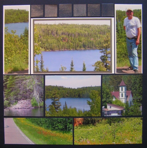
The second page is an adapted version of a page pattern called Symmetrical Photo Collage. I plan to put the year in the 4 center blocks on the top.

Unfortunately the glittered squares don't photograph as well as I'd like, but hopefully you get the idea!
Here is the two page layout...I intend to finish several more layouts of my camping weekend...highlighting "Minnesota the Beautiful"!


