Love at First Sight

When we were given the assignment to create a page based on the book, "Letters To Juliet," I cringed. I had never heard of the book and had no idea what I would create.
Then, to help us, Tami commissioned us to create a Pinterest board filled with images that will help inspire us. When I looked at it, I was in love ... who could not be inspired by beautiful images of Italy?
Next, I dug into the book and movie. Basically, "Letter to Juliet" is a nonfiction book about the letters people write every year to Juliet, as in Romeo and Juliet, in Verona. Apparently people consider her the expert on love. A non-profit group answers the letters in Juliet's name.
I was so intrigued by this thought, I checked out the organization online.
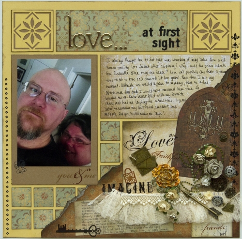
When I sat down to do my page, I decided to pull the colors of Verona ... soft yellows and browns, along with things you might find there ... skeleton keys, arches, delicate ironwork, muted tiles and lace. I pulled out one of my favorite colors of Mosaic Moments Grid Paper -- Sunflower -- and some paper that reminded me of old-world Italy from K and Company. Then I went through my stash and pulled out anything that matched my color scheme and the romantic feel I wanted for the page.
I found book pages, rub ons, trims, buttons, an old envelope and more. The arch is a Memory Box die. The rub ons are from KaiserCraft. I added metal envelopes and postcards from Hobby Lobby to represent the letters Juliet receives and an arrow to represent the tragic death of Romeo and Juliet.
With all of supplies ready to go, I began to work on my page. I knew I wanted a collage so I did something a little different with the grid paper ...
I tore my first sheet of paper and inked the edges to provide an old-world feel. I knew I would tuck things behind the paper, so I did not put adhesive near the grid lines.
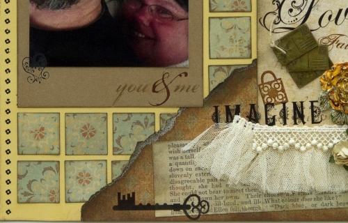
The photo is a selfie from my iPhone of my husband and I. There was not enough light in the room, so the photo is grainy and the colors are muted. It is not the quality of a photo I would normally use, but I thought it was perfect for this page, where a crisp, bright photo would be out of place. I used a Paper Tile in Caramel as a photo mat and added rub ons to blend it in.
The tiles are punched paper that I then inked to give it a bit more definition. You can see one uninked on the bottom of the photo above. See what a difference a little ink makes?
The tiles were tucked under the torn paper.
I thought the Jasmine Cornerstones in Sunflower matched perfectly with the feel of the page. However, on white, they were too bright and flowery. I wanted them to look more like a tile or a carving, so I swapped out the white background for a caramel one. And, I inked the edges to give it a bit of definition between the background paper.
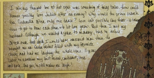
For my journaling block, I used a softer patterned paper with the edges inked. I cut it to fit the grid paper and then tucked it behind my collage.

My journaling tells of how I never believed in the strong love-at-first-sight feelings felt by Romeo and Juliet and other fairy tales until I met my husband and felt those feelings.

I finished off the title with gold Thickers and letters cut from a Die-Versions die.
I love how this page turned out ... I think it is one of my favorites of all time. What do you think? Do you see "Letters To Juliet" in this layout?


