MMDT Challenge #21: Scavenger Hunt

This was my favorite challenge so far on the Design Team. And, since we are in the last two months of a full-year commitment, that is saying a lot!
This time, we were given a huge list of items to find and photograph that showed the fall experience. I had a great time doing it and took so many photos, that many did not fit on the layout, so I will be doing several fall pages in the upcoming weeks!
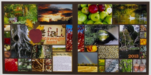
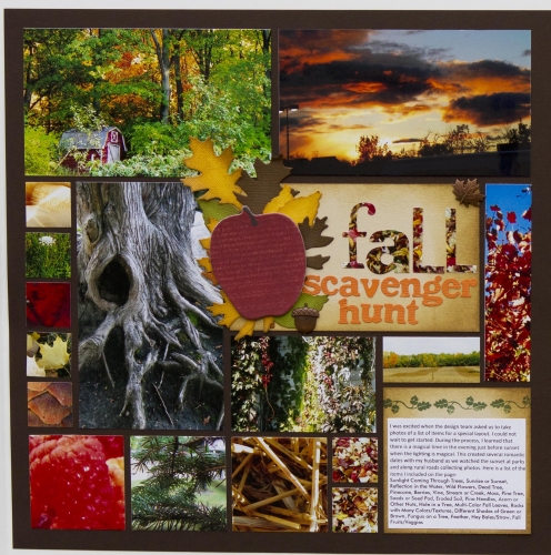
Here is my layout ...

Here is the journaling:
I was excited when the design team asked us to take photos of a list of items for a special layout. I could not wait to get started. During the process, I learned that there is a magical time in the evening just before sunset when the lighting is magical. This created several romantic dates with my husband as we watched the sunset at parks and along rural roads collecting photos. Here is a list of the items I included on the page:
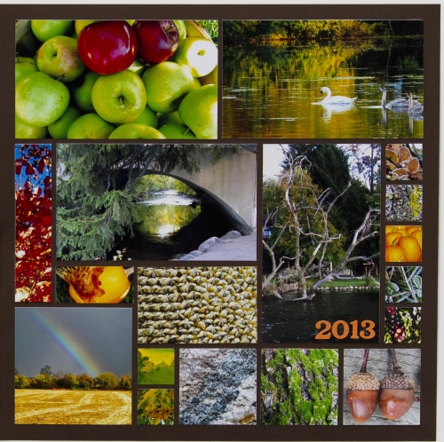
Sunlight Coming Through Trees, Sunrise or Sunset, Reflection in the Water, Wild Flowers, Dead Tree, Pinecone, Berries, Vine, Stream or Creek, Moss, Pine Tree, Seeds or Seed Pod, Eroded Soil, Pine Needles, Acorn or Other Nuts, Hole in a Tree, Multi-Color Fall Leaves, Rocks with Many Colors/Textures, Different Shades of Green or Brown, Fungus on a Tree, Feather, Hay Bales/Straw, Fall Fruits/Veggies
 I used Cocoa Grid Paper and Sand Paper Tiles to create the layout. I added a bit of Distress Ink to the edges of the Paper Tiles.
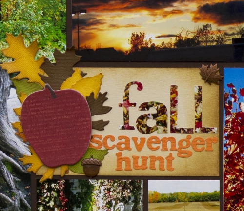
For the title, I cut letters out of an additional photo (with a Tim Holtz die) and then used cardstock to create the leaves (a Tim Holtz die) and smaller letters (QuicKutz Die). The apple chipboard piece and the metal leaf and acorn are from Bo Bunny.

I had planned to include a little twine, some fall stamps, burlap and some additional embellishments, but I didn't want to waste any photo space, so they were left on the cutting room floor. I also decided to type the journaling on the computer so I could fit the maximum words into the smallest possible space.
I used a stamp Tami Potter designed to add just a little touch to the top of the journaling block.
Like I said, I had a wonderful time completing this challenge. But I did learn a few things. First, I learned how to use the macro setting on my computer. It took dozens and dozens of photos and quite a bit of frustration, but I did eventually get some macro photos that I was proud of.
There are still some that I included in the layout because they were the best of the 30 or so that I took, but I'm not happy with them. Our DT leader, Andrea, showed us some examples of amazing macro photos that I wanted to duplicate, but was not able to.
I learned the limits of my point and shoot and I think it is time to learn how to use an SLR.
Yes, I have been bitten by the photo bug!


