Challenge # 17-2013 MMDT Theme: Circles

Welcome to September and our 17th Challenge!
This week’s challenge was to work with the theme of Circles, creating a page that uses circles as part of the design.
We had a few element options that we could use:
· Patterned Paper
· Circle Tiles
· Stitching (by hand or machine)
I’ve used all three on this layout.
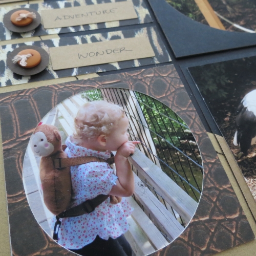
I had several different animal prints of papers and textured cardstock by Anna Griffin that I used on this page.
Notice the texture of the cardstock:


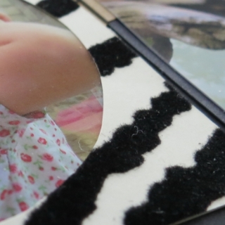
I used Black Paper Circle Tiles to frame all the corner photos on page one and then for page two I used a circle tile as a pattern to cut circle tiles in the zebra print and animal skin.
Black and Spice Paper Tiles were used to mat several of the photos.
For the 12 x 12 Grid bases I used Black and Ginger. They were machine stitched together, after cutting a circle out of the Ginger Grid. It doesn't exactly show up as well as I had hoped as the overall design continued to evolve as I worked on it! So what else is new?
How I began:
Then added photo mats cut to fit the circle theme.
The view of the double layout.
Recently we had my granddaughter staying with us on vacation; she needed to get away from her parents for a few days and sent them to Virginia. On her final day with us I wanted to take her to the zoo and take some photos of the animals. I had an idea for one of our future challenges but once home and looking through the photos I was just so excited by our day exploring it was hard not to work with that emotional element right away and use them for this circle challenge. In the future I’m going to do my best to scrap the photos I take a soon after I take them to get the best results, the best recollection of the events.
These are the first two pages of the day and I haven’t included my journaling here, but on the second layout. Sometimes you will have a group of photos that spread over several layouts and maybe even a different focus on each page. This layout was working out to best carry a color and theme with these photos and I've left other things for the next one. Check back later in the week and I’ll have the second posted. For now here are a few details of this layout.
Page 1
Title: Where the Wild Things Are. The Cricut was used to cut the title in black cardstock. I thought a letter cut out of a circle would work with the circle theme and allow the jute band show through. A layer of animal print patterned paper lies below the jute for a layered look.
The corner photos are framed with the black circle squares and each of the four photos on mats are doubled with a black and spice paper tiles to continue the circle pattern below. There are two 1 x 3 photos below each of the top photos and the space between the two I have the year inserted. I used a date strip in white, four 1” spice squares and four brown 1” circle tiles.
The photos feature the penguins, the sea otters, a goat from farmland and the grizzlies from the new exhibit. The top right photo of Izzy with Auntie Hannah’s camera as she pushes the button to take several shots of the sea otters that were so fascinating to her! If she’d managed to get them, while I was getting water rings, I would have been a bit put out…and pleased…another photographer is born! Ah, well, next time!
Page 2
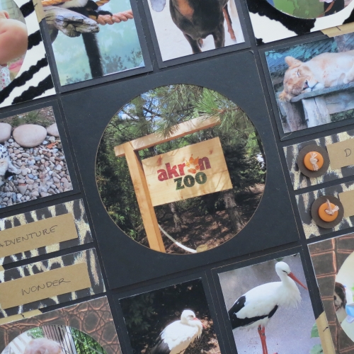
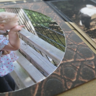
As much as I enjoyed taking animal photos I was thrilled to get a few candid shots of Izzy. In the top left photo with her face against the glass watching her sea otters and pointing and the top-right corner she’s ‘reading’ the display board. On the bottom left she is peering through the wire. We thought she was looking at the stork right below us, but she was seeing the one further into the wooded area at the water’s edge.(both are pictured on the bottom center) The final corner block was probably the highlight of her day…a carousel ride! Hannah literally had to tear her away from the ride.
It seems that most of the animals were sleeping while we visited, that included the snow leopard and the lion and lioness. My center photo of a zoo sign was framed with another circle frame in order to reinforce the circle pattern below the photo and where I've used two under layers of cardstock for a little lift.

For the word blocks I used the circles from the 1" circle frames, topped them with buttons tied with bamboo twine and used a pop dot to give them some dimension, The four words chosen to go with this page were Adventure, Wonder, Discovery, and Delight as we went throughout the zoo that day; she could barely take it all in looking everywhere to take it all in.
Well, I have a few more photos to get down on the second layout in this series so enjoy your holiday and don't forget to scrap your photos while the memory is fresh! And why not share them with us too on Journella! Stop back later in the week and be sure to see...and be sure to check out all the designers and their circle challenges!
Andrea


