Sign In or Create New Account

Remember me

Connect

The Story Board
Previous
Next
Sort Stories
Top Stories Most Recent
  |   Stories Main View   |   Stories I follow   |   Stories I've Shared   |   Favorite Stories   
 Title 
Title Author Description

MMDT Challenge #15

  For this challenge, we were to use the August Feature Grid Paper color: Sandstone, and page pattern #59.  We were to create a double page spread and include a panoramic photo sequence. 

This challenge was really exciting for me because this is what I love...creating what appears to be one photo from more than one!  You may be saying "Huh?  What does THAT mean?"  Well, I will show you!  The entire top portion of my layout is actually 5 photos pieced together.   To me, that is true mosaic!  This is a "panoramic sequence" NOT a panoramic photo just cut into strips!  (Don't get me wrong, that is great too, but I enjoy the challenge of piecing the photos together!) 

So normally I put one page, then the second page, and then the final product, but this time, I'm starting with the 2 page layout so that you can see what I mean.

Here is the layout...and here is the top with the 5 photos:


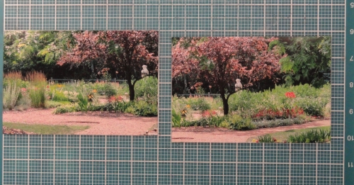
To get this look, you don't even have to have your photos exactly "even", just somewhat close.  When you take them, keep a focal point in common between one to the next (like the statue in these two photos).  Place the two side by side on your mat and look for the overlapping or close area

Then overlap them to the common point (note the line in the dirt on both photos...I used that to "match" the two).  Match up other areas as you can, and be sure to adhere them down good!  Then, you can use the grid lines to cut your 1" strips...either horizontal or vertical, or both for 1" squares!    And this.....
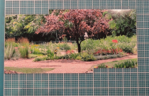
becomes this!
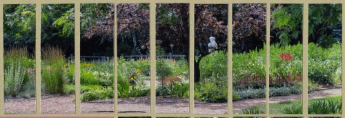
I did the same with the other side.  (The fifth photo comes in on the far left as the first two only came out to be 9 one inch strips when overlapped and cut!)

Here is page one up closer:
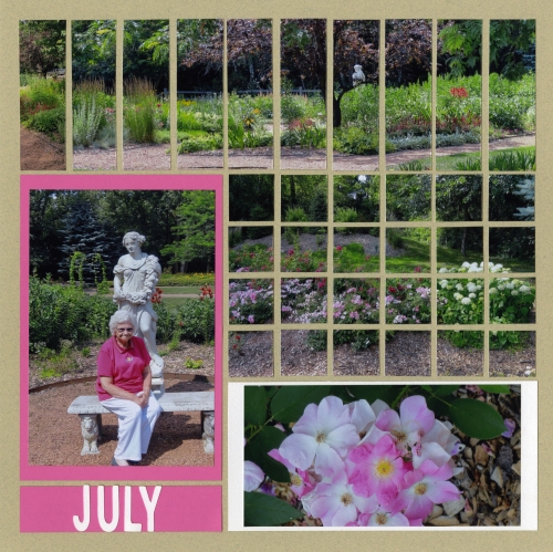
and here is page two:
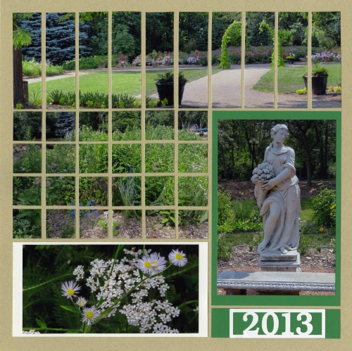
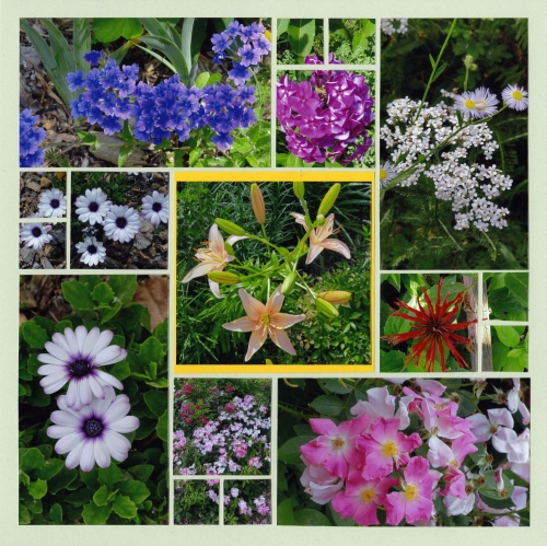
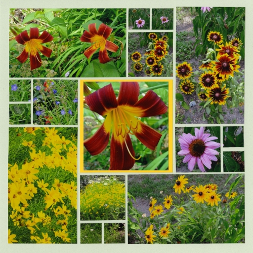
I tried to match the photos that are cut into 24 one inch squares to the top as well!  The photos are of the gardens at Fanny Hill in Eau Claire, WI.  My mom (that's her in the pink!) and I went to a play at the dinner theater there just a couple of weeks ago.  With the late spring we had, the flowers were beautiful!    SO....I had to do another two page layout with the rest of the flower photos!  Below are the other two pages!  They are on Mint Grid Paper using page pattern #50...one of my all time favorites!

I hope you enjoyed my walk in the gardens!
Shared by Lori Hanson on August 1, 2013 | Memory Date: July 31, 2013
Follow Lori Hanson
Cheer Me On
Love it ! 7
LOL! 0
Heartwarming! 0
Yummy! 0
Great Job! 0
Wow! 0
Beautiful! 3
Thnx 4 Sharing 0
Made Me Smile 0
Click an Expression to Cheer Me On.
Story Cheered By:
Comments
Lori! Absolutely beautiful. Thanks for the tip on how to get the photos even! I love all of the flowers and the colors are bright and beautiful as well, very striking layouts! I never ever thought of taking pictures of flowers before, but your layout makes me want to give it a good try!!! Great, great job!
Posted By: Shannon Nixson  |  August 11, 2013 at 9:25 pm   
Lori, great explanation to go with your layouts! Great job with the side by side at the beginning. Beautiful photos too!
Posted By: Julie Oconnor  |  August 10, 2013 at 6:04 pm   
I like how you used the pink matte to bring out the colors of the flowers against the green!
Posted By: Nancy Sanders  |  August 6, 2013 at 4:06 pm   
What a beautiful layout and a great tutorial! Thanks for sharing.
Posted By: Candy Spiegel  |  August 4, 2013 at 11:09 pm   
Lori - this layout reminds me of one of the first photo layouts in Tami's book. You did a great job and I love the way you took us through the process of how you cropped and cut the photos. This is really beautiful.
Posted By: Dale Hill  |  August 4, 2013 at 6:28 pm   
Lori!!! I've been so busy with work and getting my house put together, and to top things off, my roommate just got a kitten!!! I was panicking about this challenge, and here I sit on Saturday morning to put mine together and yours is so beautiful and you made it look so easy that I am now calm :) Thank you for sharing the instructions...I know they're in Tami's book too...and now I'm looking forward to working on mine!! I love gardens too, and your pictures are incredible! Great colors in the flowers and I love the statue! What a great job you did!!!
Posted By: Heather Cartland  |  August 3, 2013 at 2:05 pm   
Lori, what a beautiful pair of layouts. I so appreciate the step-by-step instructions for making a panoramic that you have included. We can over rely on camera settings at times and it's often a job you do best by eyeballing it yourself! Gorgeous flowers, lots of color. You certainly enjoyed putting this one together, and yes, I did enjoy this walk through the garden with you!!
Posted By: Andrea Fisher  |  August 2, 2013 at 9:42 pm   
Your pages remind me why I love strolling through gardens so much. So many beautiful things to look at! Your panoramic tuned out great and the floral pages are beautiful! Thanks for sharing the extras.
Posted By: Tami Potter  |  August 1, 2013 at 2:05 pm   
     

Terms of Use | Privacy Policy | Contact Us © 2024 Journella LLC

Help us Grow on Delisous Find us on Facebook Follow us on Twitter