#14 Working Out
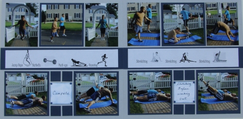
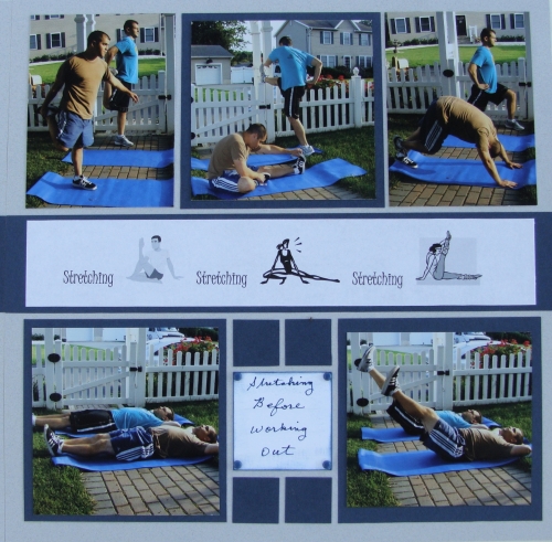
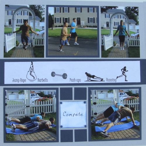
My two favorite subjects helped me with this layout. I enlisted Nick and Jeff to be my subjects for a series of images. I snapped photos of a typical workout. The photos demonstrating stretching showcase the theme best, but the ab crunches also show the exercise in progress.They are very athletic. Jeff has done mini triathlons and Nick is in the National Guard and PT is part of his day routine.
I took so many pictures that I wound up making a two-page layout.

The elements used were:
Granite Mosaic Moments Grid paper
Midnight Blue card stock
Clip art
Powder Puff inks
Brads
I did not follow any page patterns from MM for this layout.
For the stretching page, I printed clip art for my center banner printed in black and white. The clip art was in color and there were too many variations of colors like neon pink, yellow and red. I think the B&W worked best.

I also journaled "Stretching before working out".
The second page is jumping rope, push ups and running; a series of exercises. In the top left corner on the page below Nick is jumping rope. He was jumping so fast, I had to take about 15 photos before I got one showing the rope and you barely see it. In the top right photo, Jeff is in mid air and the rope is under him. Every time I look at this photo, it looks like someone drew an oval around him and then I realize its the rope.

For the journaling squares, I inked white card stock, hand wrote the words and applied brads to the corners.


