Sign In or Create New Account

Remember me

Connect

The Story Board
Previous
Next
Sort Stories
Top Stories Most Recent
  |   Stories Main View   |   Stories I follow   |   Stories I've Shared   |   Favorite Stories   
 Title 
Title Author Description

MMDT #13 - MY SPOT

For this project, the theme is "My Spot on the Big Blue Marble".   I had several thoughts on this, but then settled on my actual "spot"...my home.   I love my house and the neighborhood I live in, along with the people and critters IN the house!  I had a totally different idea for this project...until I looked at the criteria again and saw "Page Pattern #48".  OOPS!   So, while my project kept the same general idea, it took a little different turn!

One of the element options for this project was "Layered Photo Elements".  I used some layered photos, which I will detail later, as well as layered other elements.  The grid paper is spring green.

I decided to start from the big picture and narrow in on where My Spot exactly is.  So, I started with a piece of Bo Bunny patterned paper of the planet.  I had another piece of patterned paper (from Jane Shasky's Paper Boutique Travel pad) with North America, which was the perfect size for the top right corner!  Then I got a Paper Wizard die cut of the United States, and an Archiver's die cut of Minnesota.  Reminisce Jet Setters makes state stickers, so I bought the Minnesota pack, and while browsing thought the clearance section, I found the Jolee's "hands" embellishments... perfect for pointing to "the spot"! :)  Here is how the patterned paper started out,     

and here is the finished page 1. 
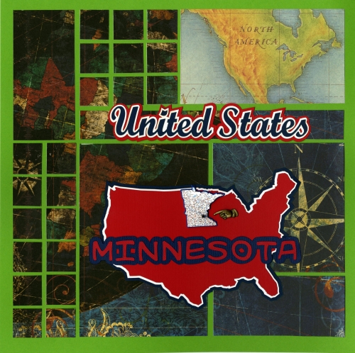


 Yep, this is where I live!  

The second page (the mirror image of pattern #48) shows the city and street I live on.  I did have the house numbers too, but then decided maybe I'd better not advertise too much on line!  I went down the block to the school and took some Edina photos, then took one of my street sign.  No, the photo isn't streaked...the white line coming down is actually where the cross street part of the sign is!  I layered those photos. 
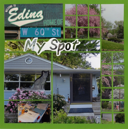
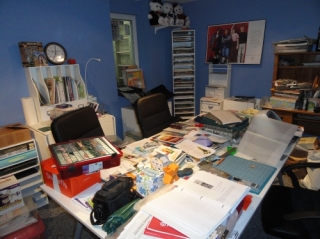
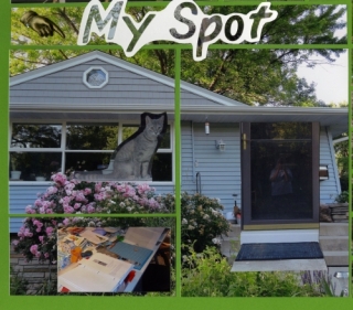
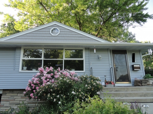
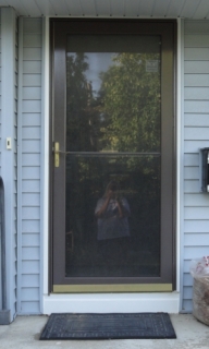
Then, I blew up the photo of my house to 8 1/2 by 11.  Over that I layered what was a photo of my cat in the window, my scrapbooking room (which is in the basement) and the photo of the doorway with me in the reflection!  My other kitty WAS there looking out, but decided she didn't want her picture taken, I guess!  Here is the original house photo and the three photos I used to layer over it, and the final product of the bottom left hand section!


I cut the letters out of a scrap of photo, layered them on white paper and cut around them for my title.  I added the hand embellishment to point to "my spot"!

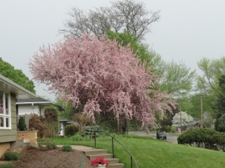
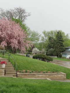
The remaining sections are photos of my street.  The top right is actually two photos blended together.  My street is very quiet and also very beautiful....lots of beautiful landscaping and trees!
The instructions for this technique can be found in Tami's book, available on www.snapncrop.com.

Here is the 2 page spread in full. 

 Hope you enjoyed your trip to "My Spot"!


Shared by Lori Hanson on July 4, 2013 | Memory Date: July 4, 2013
Follow Lori Hanson
Cheer Me On
Love it ! 3
LOL! 0
Heartwarming! 0
Yummy! 0
Great Job! 3
Wow! 0
Beautiful! 0
Thnx 4 Sharing 0
Made Me Smile 0
Click an Expression to Cheer Me On.
Story Cheered By:
Comments
I LOVE this layout! Love the cat and the globe page and your house looks adorable. I want to come visit :) What's for dinner? Great job!
Posted By: Heather Cartland  |  July 16, 2013 at 1:52 am   
Julie...LOL! I have been to the Archiver's there MANY times (probably too many, though I go to the one at Eden Prairie Center even more often...they know me there!). I went to Scrapfest once...said NEVER AGAIN! While I loved the classes, it was just too crowded and you have to wait in line for hours and still never get all of the make and takes done. NOT my idea of a good time! Give me a CKC or CKU any time! In fact, I think a CKC is where I met Tami for the first time! :) If you ever get to the Mall or anywhere else around here for that matter, please let me know! We'll have lunch or something! That goes for the rest of you as well! Come scrap with me! ;)
Posted By: Lori Hanson  |  July 10, 2013 at 6:58 pm   
Lori, love the title page and the die cut of U.S. and Minnesota. The colors and papers used were brilliant! I've never been there but it is already on my bucket list. My best friend goes there all the time. Nice job on joining the two pics at top of page two. Looks like a great place to live.Have you been to the Mall of America at Archiver's Celebration??
Posted By: Julie Oconnor  |  July 7, 2013 at 6:19 pm   
I enjoyed the large United States and Minnesota highlighted on that page. Your house looks very warm and inviting. The layering came out great. Your street with all those beautiful trees looks like a great place to take a walk.
Posted By: Dale Hill  |  July 7, 2013 at 6:05 am   
I love this idea! I like how you started out globally and then slowly broke it down to show your very own place in the universe. Great idea!
Posted By: Candy Spiegel  |  July 6, 2013 at 9:05 pm   
I like how the globe paper looks cut up to show the gird design. The spring green is a great contrast to the deep rich colors in the pattern paper. I think your first page would make a great "Intro page" to a album dedicated to "your spot/town."
Posted By: Tami Potter  |  July 6, 2013 at 8:54 pm   
Fantastic. I liked the larger world view on the left and the intimate view on the right. I like the collage feel from the layer and the mosaic quality of the layout. I liked the color selection and the way you tied everything together. I liked the additional photos that showed in your narrative and the photo layering that told so much more of your store. I liked visiting your home.. Thanks.
Posted By: Diane Cook  |  July 6, 2013 at 2:55 pm   
I did enjoy my trip to your spot! I liked the addition of layered photos like placing your scrapbooking room over the area of the photo that would be your basement. Where a reflection of yourself might otherwise 'ruin' another photo, this one adds to the theme! I really like the idea of page one beginning big with the "Big Picture" and working down to the town with page two detailing to the home.
Posted By: Andrea Fisher  |  July 6, 2013 at 7:06 am   
     

Terms of Use | Privacy Policy | Contact Us © 2025 Journella LLC

Help us Grow on Delisous Find us on Facebook Follow us on Twitter