Sign In or Create New Account

Remember me

Connect

The Story Board
Previous
Next
Sort Stories
Top Stories Most Recent
  |   Stories Main View   |   Stories I follow   |   Stories I've Shared   |   Favorite Stories   
 Title 
Title Author Description

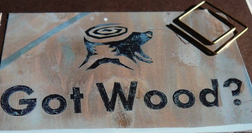
GOT WOOD?

Photo Challenge #12

Take photos inspired by the alphabet. I was perplexed about this layout from the first time I read about it. Thankfully, I started taking photos for all the other challenges at the same time. The photos were there all along! I just had to figure it out.

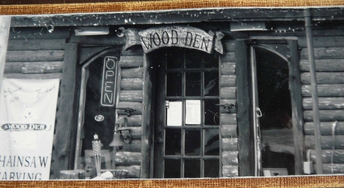
Page one is inspired by an old train depot along the railroad tracks in Crystal City, Missouri. Years ago a pet groomer had a business in it.  A  wood carver now uses this building to sell his products. You may have seen him or some works like his at a county fair.  He carves wood using a chainsaw.  He makes beautiful works of art with cedar and oak logs. He makes signs, furniture, totem poles and more.  His place looks pretty cool.  On one of my trips to pick up produce from the local coop I took some pictures of his business.  I thought the pictures would look good in black and white.  After challenge #11 I started pondering what to do with this mysterious alphabet journey. One day I was flipping though recent photos on my camera and saw one of his carvings. The light went on and that was it! The first time I saw his company was at the county fair. They were making family name logs to put in front of your house. (see page two through canoe,  totem pole and dog)

I used cocoa grid paper from snapncrop.com
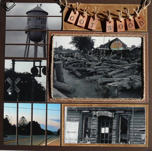
 

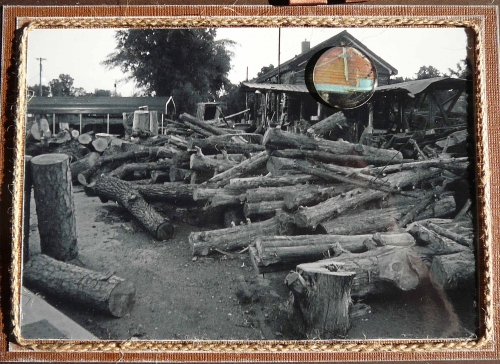
Note the acrylic bubble over the cross on the side of his building. I took a color photo that matched and cut out a circle over the part I wanted accented.
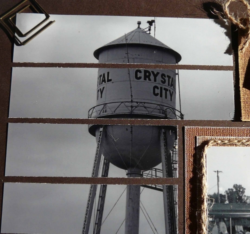
The water tower for the town is located near where coop pick up area is...what started my alphabet journey before I knew it.
My title was made of jute cord from JoAnns, wood chips unknown (old and found by accident), mounted on core'dinations card stock that I sanded.

This photo is the light at the railroad track behind the depot - now called "The Wood Den".
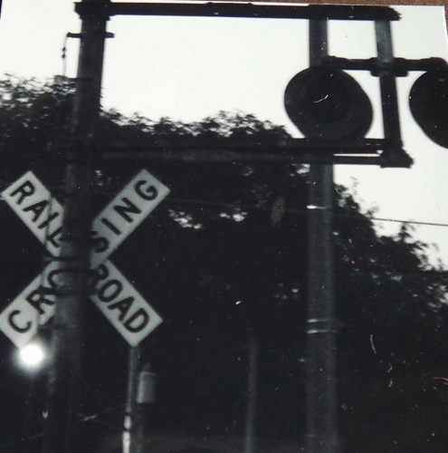
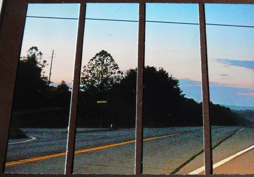
This photo and the railroad crossing  was taken on my way to work last week about 05:15am. The sun was coming up and the sky was beautiful.
  The front of the Depot - now Wood Den.
 

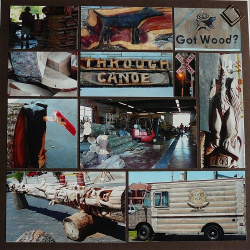
 Page two is below. His business has expanded to across the street a vacant furniture store. He let me take pictures of the inside and out.
  

  Close up of one his trucks. Painted like logs.
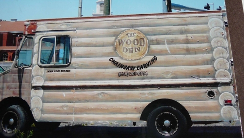
 

Close up of logo on back door of above truck.
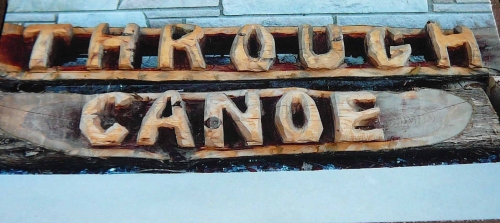
This is where it all started. You'll see these family name logs throughout the community.
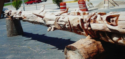
This totem pole is being made for Boy Scout Camp at S Bar F. This one is not complete, but is a beautiful work of art!
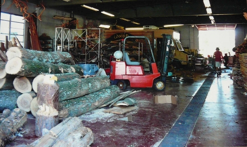
 A peak in side the factory.
  

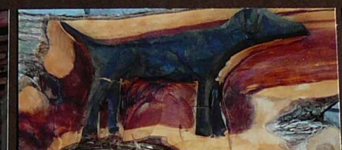
Bird dog on cedar.
 Hope you enjoy this as much as I had fun putting it together. Julie


Shared by Julie Oconnor on June 20, 2013 | Memory Date: June 19, 2013
Follow Julie Oconnor
Cheer Me On
Love it ! 5
LOL! 0
Heartwarming! 0
Yummy! 0
Great Job! 3
Wow! 0
Beautiful! 0
Thnx 4 Sharing 0
Made Me Smile 0
Click an Expression to Cheer Me On.
Story Cheered By:
Comments
Ditto what everyone else has already said! Love the jute on the black and white and the acrylic bubble over the color focal point. Photos are spectacular and what a great story to go with it! Those little wooden tags would be perfect for the next challenge as well!! Great job, Julie!!
Posted By: Heather Cartland  |  July 1, 2013 at 2:11 am   
Several great ideas in this layout - I love the bubble with the color photo, and your wood title!
Posted By: Nancy Sanders  |  June 30, 2013 at 11:34 pm   
Thank you all for your kind words :)
Posted By: Julie Oconnor  |  June 27, 2013 at 12:26 am   
I love the wood tags and the rope framing the B&W photos. This page is great. I am going to use the ideas in my scrapbooking. The rope over the textured matting gives the photos a rustic look. Great job.
Posted By: Dale Hill  |  June 25, 2013 at 4:11 am   
I love the first page in particular. The black and white accented by the color looks great. The texture on that page is great, and I love the "got wood" tiles. The texture on page two is great, too..but I really love page one! Nice job!
Posted By: Lori Hanson  |  June 24, 2013 at 2:56 am   
Texture! I love the texture! It's the perfect complement for the story of how much influence one small business can have on customers near and far. It's a visual story and you've captured the vision in a unique way. Love it.
Posted By: Diane Cook  |  June 22, 2013 at 12:04 pm   
Showing the color image on top of the B&W is a great way to highlight a small detail that you want noticed. Nicely done!
Posted By: Tami Potter  |  June 20, 2013 at 4:12 pm   
Julie, I like the way you highlighted the cross on the building by doing it in color and using an acrylic circle. Thanks for the technique tip! I keep saying I'm going to use them in my layouts and always forget. Neat way to create a focal point! The wooden tags, twine and sanded Core'dinations cardstock are perfect for your theme. Love learning about this artisan too!
Posted By: Andrea Fisher  |  June 20, 2013 at 3:56 am   
     

Terms of Use | Privacy Policy | Contact Us © 2024 Journella LLC

Help us Grow on Delisous Find us on Facebook Follow us on Twitter