Sign In or Create New Account

Remember me

Connect

The Story Board
Previous
Next
Sort Stories
Top Stories Most Recent
  |   Stories Main View   |   Stories I follow   |   Stories I've Shared   |   Favorite Stories   
 Title 
Title Author Description

MMDT #10 - Monochromatic


Challenge #10 was a photo challenge to be inspired by Monochromatic Color.

We were to choose a color and let it inspire the photos we took.  And we are to tell:


  • About the photos you took.
  • Why did you choose the color?
  • How does the color make you feel?
  • What does the color make you think about?


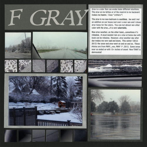
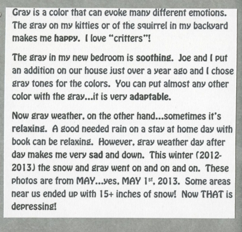
I had originally planned to use a bright, fun color.  However, winter in Minnesota went on and on …and on…and on…and on.  On May 1st, when it snowed AGAIN, I finally thought “To heck with it….I’m using gray!” 

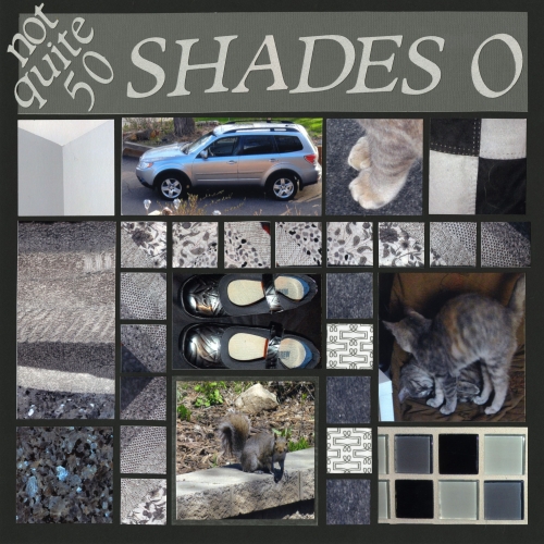
That seemed to be the only color around at that time!  After that, I got excited about using the gray because as the journaling says, Joe and I put an addition on the house last year.  I used a gray color theme, and really do like the color…unless it’s the weather!  My kitties (who are growing fast!) have gray stripes, Joe’s car is gray, my quilt has many gray on white patterns  (the one inch squares),

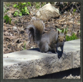
 and I got lucky and got a photo of a gray squirrel on the gray wall in our back yard. 
I took a picture of one of my kitty's feet on the carpeting, and then some of the tiles, the granite countertop, and a stack of towels in my bathroom.  The upper left photo is the corner of my bedroom where the 2 shades of gray meet (guess the little spider web also added an extra "shade of gray"! LOL!), and the right side is a section of my comforter.  And of course, my much loved new shoes!!


 Combined with the photos of “gray” weather,


I captured what I titled “not quite 50 Shades of Gray”! 

The journaling says a lot about the color, what it makes me feel and what it makes me think of.
 

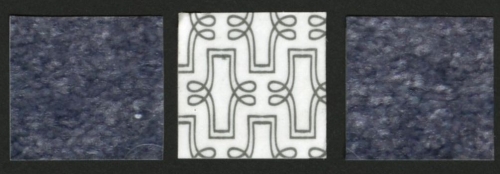
The grid paper I chose is just basic black.  I used a variation of page pattern number 20.  The one inch squares are from photos of my quilt, my dashboard, my carpeting, and a few squares cut from the new Lifestyle Crafts Paper Goods Shape 'N Tape (the middle square below).  I also used that to back the journaling and a couple of the photos.  It's really neat new adhesive sheets that you cut out, peel off, and stick!  I used gray and silver...patterned and solid. 
Enjoy! :)


Shared by Lori Hanson on May 20, 2013 | Memory Date: May 20, 2013
Follow Lori Hanson
Cheer Me On
Love it ! 8
LOL! 0
Heartwarming! 0
Yummy! 0
Great Job! 0
Wow! 0
Beautiful! 0
Thnx 4 Sharing 0
Made Me Smile 0
Click an Expression to Cheer Me On.
Story Cheered By:
Comments
After looking at your page, I can see where one could come to love gray. It really makes the textures stand out!
Posted By: Candy Spiegel  |  May 29, 2013 at 9:24 pm   
You did a great job. Gray is not an easy color to work with, but you chose great subjects to photography. The cool gray colors give dimension to the warm gray colors. I really like this.
Posted By: Dale Hill  |  May 28, 2013 at 2:33 am   
Gray is so artsy! I like your use of animals and shades inside and out. The layout has a clean and crisp look. Is it the color that makes it crisp or is it the technique? Great job.
Posted By: Diane Cook  |  May 23, 2013 at 6:13 pm   
Had to laugh when I saw your title. Bought a tshirt at CKC convention that's pink and says in varing tones of gray letters "50 shades of cardstock". Beautiful photos, nice choice of color and so versatile too!
Posted By: Julie Oconnor  |  May 22, 2013 at 2:12 am   
Great title!! I would not have thought of so many things that are actually pretty in gray!! Especially KITTIES!! :)
Posted By: Nancy Sanders  |  May 21, 2013 at 2:28 pm   
Lori, I love it!!! The play with the title which is so "now" and the grey that comes with an everlasting winter that sometimes just won't go away. You did a great job!
Posted By: Tonnya Sayah  |  May 21, 2013 at 1:07 pm   
Lori...you are so funny! When I read that our challenges had to use new photos, I wondered what the heck I was going to take pictures of as "springtime" in WI looks very much like "springtime" in MN!! Not very pretty, is it? You did a great job of capturing all the different shades of gray in your layout. The cat paw photo is my favorite! Nice job!
Posted By: Heather Cartland  |  May 21, 2013 at 2:47 am   
The title is timely - love it. I hadn't thought of gray but it really can be a very pleasant color, especially with all the texture.
Posted By: Tami Potter  |  May 21, 2013 at 1:35 am   
Love seeing the fabric tiles and the tile tiles too! Cool grays and warm grays work nicely together. You made the best of the dreary weather and came up with a great layout of 'shades of gray' in your life. Journaling about the moods that gray can create for you is also nicely done! To be honest, gray is one of those overlooked and under appreciated colors and you have done it proud!
Posted By: Andrea Fisher  |  May 21, 2013 at 1:02 am   
     

Terms of Use | Privacy Policy | Contact Us © 2025 Journella LLC

Help us Grow on Delisous Find us on Facebook Follow us on Twitter