Sign In or Create New Account

Remember me

Connect

The Story Board
Previous
Next
Sort Stories
Top Stories Most Recent
  |   Stories Main View   |   Stories I follow   |   Stories I've Shared   |   Favorite Stories   
 Title 
Title Author Description

MMDT Challenge #8

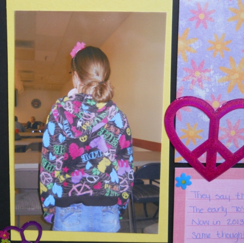
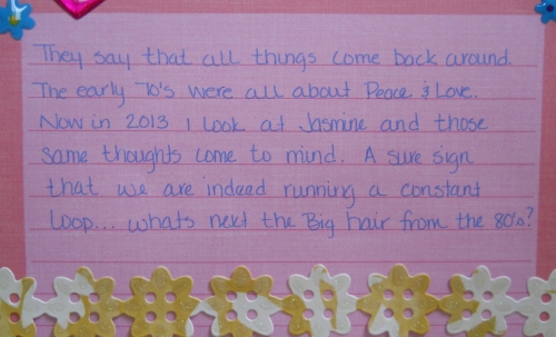
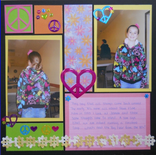
I have to say of all the challenges in our first quarter this one troubled me the most.  I just could not wrap my head around it.  Inspired by pop culture from the decade you were born...I was born in the 70's but new little to nothing about them as I grew up in the 80's (that will be a page for another day).  I think the hardest part was that at least one man focal image had to be current and I just could not find anything --- until about 2 weeks ago when attending my great niece & nephews first birthday party my 10yr old niece shows up.  Her outfit was exactly was I had been waiting for!  

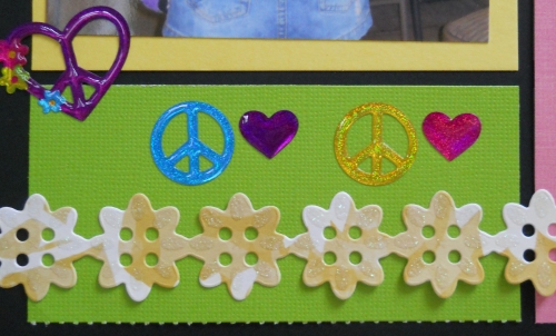
Since this was such a challenge for me it is one of the very few single page layouts I have ever done.  I started with a black grid paper and used many elements including a flower border from K & Company, the patterned paper is from DCWV Pocket full of posies stack and the stickers were from EK success, the journaling block is from a Creative Memories Storybox and of course a cornerstone from www.snapcrop.com.  I did trade out the white background of the cornerstone for a neon green to fit the rest of the page. 

Peace out!


Shared by Tonnya Sayah on April 25, 2013 | Memory Date: April 25, 2013
Follow Tonnya Sayah
Cheer Me On
Love it ! 1
LOL! 0
Heartwarming! 0
Yummy! 0
Great Job! 0
Wow! 0
Beautiful! 0
Thnx 4 Sharing 4
Made Me Smile 0
Click an Expression to Cheer Me On.
Story Cheered By:
Comments
This page layout is so sweet. You really captured the 70s so well. The colors are great and the embellishments are perfect. Great job.
Posted By: Dale Hill  |  May 6, 2013 at 1:51 am   
Glad you found your inspiration! What a great jacket! Pretty niece, too! Your page captures the essence of the era...love those heart-shaped peace sign stickers. Cute!
Posted By: Heather Cartland  |  May 5, 2013 at 3:05 am   
I love the peace signs and the colors! So bright and pretty. It came together nicely. Nice Job!
Posted By: Shannon Nixson  |  May 5, 2013 at 1:44 am   
It is fun to see a new spin on an old style isn't it? The jacket certainly has that "inspired by the 70's" look.
Posted By: Tami Potter  |  May 3, 2013 at 2:10 am   
Tonnya, the black grid and bright colors of the paper and stickers look nice. It is amazing to see all the fashion returning from that era. I've noticed those short sleeve sweaters that look like 2 pieces but are only 1 they are from the 70's too :)
Posted By: Julie Oconnor  |  April 29, 2013 at 10:46 pm   
Wonderful! There's a nice balance here as you showcase the colors and symbols. Of course, it was most advantageous to find this in fashion as well. Great job.
Posted By: Diane Cook  |  April 25, 2013 at 4:26 pm   
Tonnya, thanks for giving the 70's a chance...can't believe that the fashion is resurfacing in any way, shape or form...but your niece's jacket did give you a "now" photo!
Posted By: Andrea Fisher  |  April 25, 2013 at 3:09 pm   
Great Job ... you captured the colors of the 1970s -- and one of the big signs, too!
Posted By: Candy Spiegel  |  April 25, 2013 at 2:33 pm   
     

Terms of Use | Privacy Policy | Contact Us © 2024 Journella LLC

Help us Grow on Delisous Find us on Facebook Follow us on Twitter