Sign In or Create New Account

Remember me

Connect

The Story Board
Previous
Next
Sort Stories
Top Stories Most Recent
  |   Stories Main View   |   Stories I follow   |   Stories I've Shared   |   Favorite Stories   
 Title 
Title Author Description

Challenge #7-2013 MMDT-"Beautiful Feet"

MM Challenge #7 Feature Grid Bahama Blue

“BEAUTIFUL FEET”


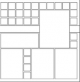
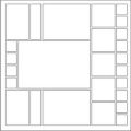
This challenge features the Bold, Bright Bahama Blue Grid paper! It’s just the right color to wake up spring and usher in the summer.  The Challenge also included the choice to use of a FREE download from www.snapncrop.com, stickers, or my choice of Handwritten Journaling. We also got to pick our own page pattern. I’ve done a double page layout, so I’ve chosen two different page patterns. Page one was pattern #78 upside down, and page two is pattern #40 a quarter turn to the left.
 

Other items used in this layout:

·         Paper tiles-Red, Orange, Green, Watermelon  Sensation , Caribbean Blue, Pineapple Bliss

·         Doodlebug paper: 3753 Color Waves

·         Aqua Sharpie marker


I had plans to shoot the Beach Party on Thursday, cutting it short to post on time, but do-able as long as nothing got in the way. Right. Needless to say the week did not go as planned. However, I’m trying to get this posted on time, so seeing as I’m short on time I’ll keep this short and sweet.


Page One


Page Two


Bright Lights is a young girl’s ministry that my daughter Hannah and her friend Danielle have been involved with leading.  This was a special event this week, it combined a lesson, prayer time, singing, play time, a couple of projects, one for themselves and one for a medical mission in Mali, Africa. Oh, yes, and food! This was a special meal with food that was all beach themed. The girls got their ideas on Pinterest, and did a wonderful job!

Thanks for stopping by and leaving a comment. Be sure to check in and see all the other Design Team’s pages done in Bahama Blue…then be sure to stop by www.snapncrop.com  where it’s the featured paper on sale this month along with the “Orchid” Trio Paper Tiles.


andrea

Shared by Andrea Fisher on April 6, 2013 | Memory Date: April 6, 2013
Follow Andrea Fisher
Cheer Me On
Love it ! 8
LOL! 0
Heartwarming! 1
Yummy! 0
Great Job! 0
Wow! 1
Beautiful! 1
Thnx 4 Sharing 0
Made Me Smile 0
Click an Expression to Cheer Me On.
Story Cheered By:
Comments
Amazing colors! Great job.
Posted By: Candy Spiegel  |  April 25, 2013 at 2:59 pm   
How did I miss this?? What a colorful layout! I love all the FUN and you know I love feet!! You are a fabulous photographer and I especially like the picture of the underside of the umbrella! All those colors look so perfect with the Bahama Blue! Nice job!
Posted By: Heather Cartland  |  April 19, 2013 at 1:38 am   
I love how you used the chevron design in paper tiles. The colors are great and the photo of the feet with the journaling looks like it came right out of a magazine advertisement.
Posted By: Dale Hill  |  April 18, 2013 at 2:09 am   
Great layout - like the chevrons and colors. Beautiful story as always :)
Posted By: Julie Oconnor  |  April 12, 2013 at 2:05 am   
Very bright, beautiful page. The chevrons gives it an appearance of movement. Very nice job, as usual!!
Posted By: Shannon Nixson  |  April 11, 2013 at 11:12 pm   
These pages are right up my alley.... bold, bright, and beautiful! I love the concept behind the story as well as the story itself. You do an amazing job!!!
Posted By: Billi Glenn  |  April 10, 2013 at 6:01 am   
You did it again! Great job! All the colors were spectacular. And as Tami said, "Very nice handwriting." The idea is dear to my heart, also so love the whole concept.
Posted By: Janet Shetley  |  April 9, 2013 at 10:07 pm   
Chevrons are very much in trend these days. They seem to help keep our eyes moving onto the next highlight. The story and colors work well and the Beautiful Feet theme fits. Thanks.
Posted By: Diane Cook  |  April 9, 2013 at 4:53 pm   
Even when pressed for time, you do a beautiful job! I LOVE the bright colored patterned paper...and the middle piece actually creates an optical illusion of getting larger toward the journaling! Very cool! Sounds like a wonderful program, and looks like a lot of fun as well! AGain, the colors are just FABULOUS!!!!
Posted By: Lori Hanson  |  April 7, 2013 at 9:16 pm   
Very nice handwriting! The colors used are so attractive - love your choice of patterned paper and how you cut it. It really adds a lot of interest to your page and enchances the great photos.
Posted By: Tami Potter  |  April 6, 2013 at 1:16 pm   
     

Terms of Use | Privacy Policy | Contact Us © 2025 Journella LLC

Help us Grow on Delisous Find us on Facebook Follow us on Twitter