Challenge #6-2013 "Time Began in a Garden"
Challenge #6 Photo Challenge - Inspired by… A Famous Artist
Choose a famous artist and let him/her inspire the photos you take/use
Create a page that is inspired by the kind of art that catches your eye.
In your Journella Post you should include the name of the Artist, style, or specific painting that you chose for inspiration as well as further explanation of the inspiration. (If possible include the image that inspired you in your post.)
Introducing the Artist of Inspiration
Remington, Russell, Bierstadt, and Constable, artists I admire. But my photos don’t reflect life on the prairie for the first peoples, or the cavalry, and I certainly haven’t caught the majestic views the same way Bierstadt or Constable have. So trying to settle on an artist that I could represent in photos became a bit of a challenge for me and a roadblock. While Mondrian would be perfect for a page style layout, I had no idea how to capture that style in a photo challenge.
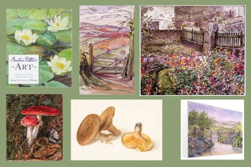
So, I began to look for clues in the photos I have taken…what do the vast majority of my pictures have in common? Like many of you, I take the photos of events, birthdays, babies, Christmas, vacations. Many are just documentary in style. Record the event. What I found was a huge amount of detailed photos of “still life” flowers, wood rails, mushrooms, ponds, streams, waterfalls and barns. It took me back to an exhibit my Mum and I took Hannah and David, and maybe Nathan in a stroller to at the Cleveland Museum of Natural History, many years ago. The artist on display was Beatrix Potter. While I envisioned a vast collection of Peter Rabbit and friends, I was surprised and delighted to also see the other side of the illustrator. Her detailed studies of animals, plants, and fungi really showcased her skills at observing. Her paintings reflected the nature she was surrounded by and it is Miss Potter herself that is my famous artist for this challenge.
I love the watercolor illustrations of her children’s series; I believe every child can learn to appreciate art from a well-illustrated book. Many choices I’ve made for reading material over the years for my children has first been a quality story, then good illustrations. As I was looking for books to give Isabella to start off her library I was appalled to find that a new series of Potter Books had come out without any of her drawings. They were instead replaced by simple flat graphic drawings with no life at all in them. Not sure who thought that was a good idea but it made me committed to quality books even more. Seriously, who could imagine a Beatrix Potter book without HER Peter Rabbit? Scandalous! But it has been done and done repeatedly. I think it goes to make the point that Miss Potter’s work is more than mere illustration, but true art.
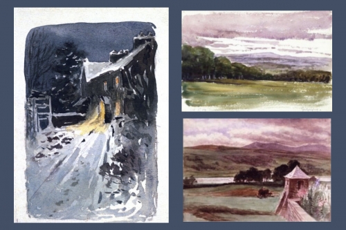
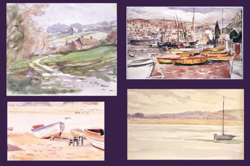
Some of Beatrix Potter's work with which you may not be familiar.


Introduction to My Photos
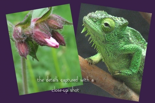
What is my fascination with close-up photo studies? Years ago Mac Davis had a big hit “Stop and Smell the Roses” a phrase that has often been repeated, but how many people actually do? Several years ago after serious illness slowed me down, I was intent on looking at things more carefully, looking at the details in creation…the handiwork…the design….close-up photos helped me to focus in, appreciating the little things in life of a world that had gone on around me, unknown. I have long since abandoned my sketchbook in favor of my camera for capturing “things” that interest me and a photo morgue of sorts has transpired. In recent years my cameras have had fantastic zooms, but also amazing close-up capability and this has allowed me to get some amazing details, especially in flowers.
flower and chameleon detail

The photos here span my digital days…a few from the early stages of trying it out with a 2mp to my current 12.1mp. The years from 2006-to present, and from Michigan’s Northwood’s to Cherry Valley, Ontario, from Scotland and the Smoky Mts. back to my own yard, this is what you’ll see.
My title “Time began in a Garden” is as much a statement of my faith as an accurate description of where Beatrix Potter found her inspiration. Her sketchbooks were full of detailed sketch studies of animals and plants from the gardens of her childhood. While most of us know her as a writer/illustrator she was an excellent botanical artist and her landscape paintings became backdrops for her characters in her books. (Her mushroom series was what inspired me to crawl on the ground to get the mushroom shots included here.) Her sketches showed the minute details that we often overlook…the very things I want to capture in my close-up shots.
page 1
detail of border
I took a note from the cover of the book and chose the ivory 12”x 12” Mosaic Moments Grid paper and Almond Cream paper tiles to build this layout. These colors perfectly represent the book cover and pages of The Tale of Peter Rabbit. Beginning with MM Page Patterns #57 and #25 and tweaking both of them to work with the page layout envisioned. The 1”x11” section on the top was repeated on the bottom and again on the second page. These strips of watercolor paper were just right to blend with the ivory and to serve as the canvas for the stamped floral borders.
page 2
In addition I have used several sets of rubber stamps from Rubber Stamp Tapestry, various chalks and inks from Versa Magic, and from Anna Griffin, Flourish Stamps for the scroll corners and center on the title block. The title font is Fairy Scroll Display and was done in watercolors.
Thanks for stopping by,
Andrea
p.s. a photo morgue is a collection of pictures that artists keep for reference on "how to draw" various items, in order to be accurate in representation in their work.


