Sign In or Create New Account

Remember me

Connect

The Story Board
Previous
Next
Sort Stories
Top Stories Most Recent
  |   Stories Main View   |   Stories I follow   |   Stories I've Shared   |   Favorite Stories   
 Title 
Title Author Description

MMDT CHALLENGE #5

For this latest challenge, we were to use the BAMBOO grid paper and Page Pattern number 52.  As usual, I did a two-page spread, with the 2nd page being the mirror image of page 1 (which is the actual pattern #52).
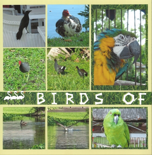
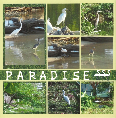
 

The color turned out to be a great background color for my bird pictures I took in Jamaica.  Most of the photos were taken when Joe and I went for a walk around the pond.  It started to pour rain, but we were right by the tennis court and a little shelter, so ducked in and hung out until it stopped.  Afterwards, all of the birds came out and were so fun to watch! 

We were to also incorporate patterned paper, a large title, or tags into our layout.  I used grass patterned paper from the DCWV Summer Stack as it worked well with the colors in the photos.  In fact, in a couple of them, the paper almost blends right in with the photos!
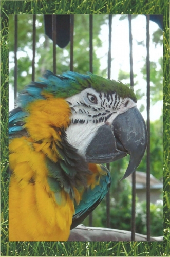
 

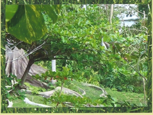
(This one has an almost "vellum overlay" look!  Can you find the bird in this photo?!)

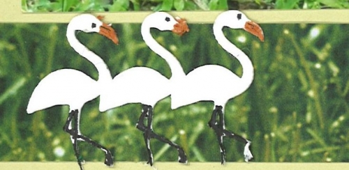
I used the same grass paper for the long strip, and put that and the title across both pages (does that constitute a large title?!).  The birds and the font are from the Cricut cartridge “Life Is a Beach”.  
 

 Enjoy! 

Shared by Lori Hanson on March 6, 2013 | Memory Date: March 5, 2013
Follow Lori Hanson
Cheer Me On
Love it ! 5
LOL! 0
Heartwarming! 0
Yummy! 0
Great Job! 0
Wow! 0
Beautiful! 1
Thnx 4 Sharing 0
Made Me Smile 0
Click an Expression to Cheer Me On.
Story Cheered By:
Comments
This is a great layout! Love the colors and the birds. I do bird photos when in St. Maarten, or anywhere with interesting birds I don't see in the northeast. Love the title from Cricut - a cartridge I have, but haven't used enough. Thanks for the inspiration!
Posted By: Libby Wiers  |  March 11, 2013 at 3:41 pm   
Lori! I love these pages! I love the green grass as your background and the birds from Life's a Beach are perfect! I agree the one photo does look like a vellum overlay and I found the bird! Or so I think :) What a fun layout and beautiful photos!
Posted By: Heather Cartland  |  March 10, 2013 at 9:30 pm   
Love the tropical style of this layout. There are so many shades of green and the colorful birds are just beautiful. Great job. I especially love the title row with the cut out of the pelicans.
Posted By: Dale Hill  |  March 10, 2013 at 8:12 pm   
Great photos! Love the font in the title with the balance of the birds on both sides. Great job!
Posted By: Julie Oconnor  |  March 9, 2013 at 6:26 pm   
Oh what fun! The grass paper brings the photos all together and makes me wish for spring here in the Northeast.
Posted By: Tonnya Sayah  |  March 9, 2013 at 2:02 pm   
Love the title with the row of birds on each end - perfect accessory to the page. I enjoyed the clever use of "grass paper" as backdrop to photos and the title.
Posted By: Tami Potter  |  March 8, 2013 at 6:42 pm   
Aren't birds fun? I love your photographs and that you captured the birds' personalities. Just keeping up can put you in sensory overload. But you handled it well. This is great.
Posted By: Diane Cook  |  March 7, 2013 at 6:54 pm   
Love how the title spans both pages almost seamlessly, true to the pattern, and the bird cutouts are a nice touch too. Great photos of the birds. What a variety, with that colorful guy really catching your eye right off the bat! It may not be 40 shades of green, but it's close for a perfect March layout. Really nice job, Lori!
Posted By: Andrea Fisher  |  March 6, 2013 at 4:08 am   
     

Terms of Use | Privacy Policy | Contact Us © 2024 Journella LLC

Help us Grow on Delisous Find us on Facebook Follow us on Twitter