Sign In or Create New Account

Remember me

Connect

The Story Board
Previous
Next
Sort Stories
Top Stories Most Recent
  |   Stories Main View   |   Stories I follow   |   Stories I've Shared   |   Favorite Stories   
 Title 
Title Author Description

MMDT Challenge #5: At the Zoo

Welcome back! Challenge #5 was to use Mosaic Moments Bamboo Grid paper, Page Pattern#52 and one or more of the following:


  • Tags
  • Large title
  • Patterned paper

I completed this layout on my trip to MI at Gotta-Scrap Inn as well. Because Page Pattern #52 has so many photos, I decided to do a zoo layout as I have a lot of good zoo photos that I’ve taken over the years. I go to the Milwaukee County Zoo every year on my birthday and I love taking pictures of the animals.


I had brought my zoo photos and some zoo paper that I had with me on my trip, but when I got to Gotta-Scrap Inn, Amy had stocked the store full of BoBunny’s Zoology collection and I just flipped for it! So, my boring zoo paper came back home with me and I used her patterned paper and embellishments. Here’s a picture of the patterned paper before I chopped it up into 1” squares:


And here is the finished product:
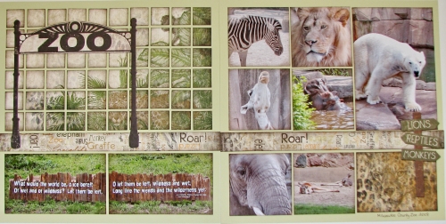


As you can see, I used the coordinating chipboard elements for the large title on the left page and the cute directional sign on the right page. The right page is Page Pattern #52, and the left page I think I invented myself. Here are some close-ups:
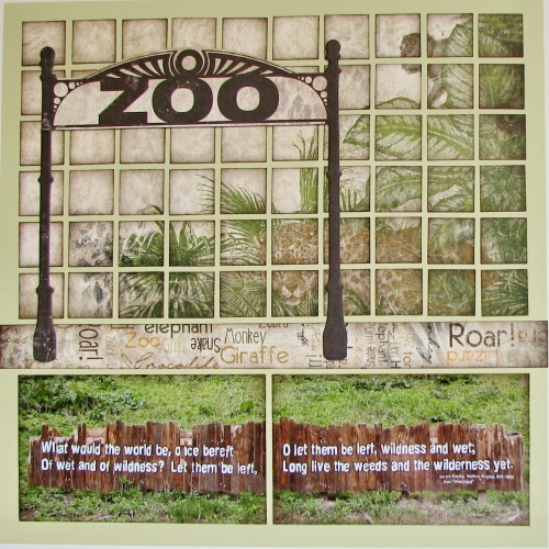


The saying is painted on a fence at the zoo and I thought it made excellent journalling!
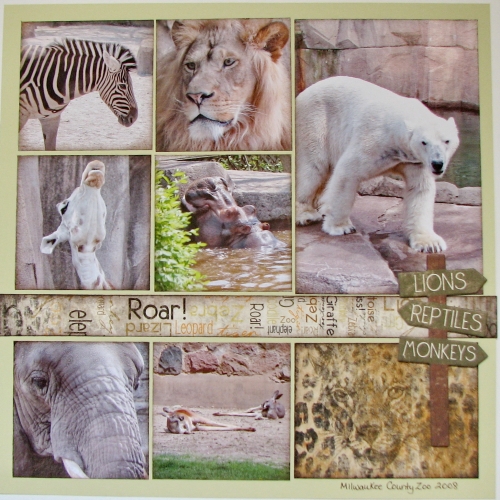


I thought I'd let the animals say it all and just put a handwritten time/place down at the bottom. I hope you enjoyed my layout! Thanks for stopping by!


Shared by Heather Cartland on March 2, 2013 | Memory Date: March 2, 2013
Follow Heather Cartland
Cheer Me On
Love it ! 7
LOL! 0
Heartwarming! 0
Yummy! 0
Great Job! 0
Wow! 0
Beautiful! 1
Thnx 4 Sharing 0
Made Me Smile 0
Click an Expression to Cheer Me On.
Story Cheered By:
Comments
This is one of my all-time favorite Mosaic pages! I love how you cut up the patterned paper. I hope you don't mind me copying that idea in the future!
Posted By: Candy Spiegel  |  March 18, 2013 at 2:07 am   
The lion drew me right in. I love zoos and especially wildlife. The patterned paper is brilliant. I love how you used the Zoo arch as your title over the mosaic patterned paper. The colors are great.
Posted By: Dale Hill  |  March 10, 2013 at 8:18 pm   
Great idea to pair a design pattern with your own - awsome job! Beautiful photos! Like the sign on page two. Love the huge title on page one. Also, like the hand written zoo on bottom of page two. Just beautiful.
Posted By: Julie Oconnor  |  March 9, 2013 at 6:08 pm   
Well done! Great shots of the animals really make it outstanding.
Posted By: Janet Shetley  |  March 8, 2013 at 6:44 am   
This is great! It makes me smile.
Posted By: Diane Cook  |  March 7, 2013 at 6:30 pm   
Beautiful! I love the muted colors. The quote across the "row of sticks" is a great addition.
Posted By: Tami Potter  |  March 6, 2013 at 3:06 pm   
Heather, I just love everything about this layout! I WANT THAT PAPER!!! I am a zoo junkie, and love to take lots of pictures there...BUT YOURS ARE AMAZING!! REALLY!! I love the way you used the patterned paper and the Zoo title over it is great, as is the sign embellishment! And you are right, the fence saying is the perfect journaling. Wonderful job!!!! :)
Posted By: Lori Hanson  |  March 6, 2013 at 3:22 am   
Beautiful layout! For whatever reason, I never even considered using the required pattern with an entirely different pattern. Well done! Funny how a person gets a brain-block like that. :) Anyway, I love the photos and can tell you spent a lot of time on the first page matching up the pattern- it looks awesome!
Posted By: Billi Glenn  |  March 4, 2013 at 3:31 am   
Heather, there are many pretty pattern papers out there that I love, but don't want to buy because I don't want to cover up the things I love about the paper...you have the greatest idea presented with how you used the paper to showcase your theme and backdrop for the title "Zoo". Love how each square is inked/chalked it adds so much! Even though page one isn't the pattern as on page two, the side to side band on each tie them together nicely. Your animal shots a terrific!! Great Job!
Posted By: Andrea Fisher  |  March 3, 2013 at 7:43 pm   
Heather!!!! Absolutely beautiful. I love the left side of the layout with the "Zoo" title-that is amazing. Very creative and outside of the box. Your pictures are beautiful as well! I love how you allowed the wording on the fence to be your journaling-very nice and very forward thinking! Great, great layout! I love it!!!!!!!
Posted By: Shannon Nixson  |  March 3, 2013 at 3:07 pm   
     

Terms of Use | Privacy Policy | Contact Us © 2024 Journella LLC

Help us Grow on Delisous Find us on Facebook Follow us on Twitter