
MMDT 2013 #3
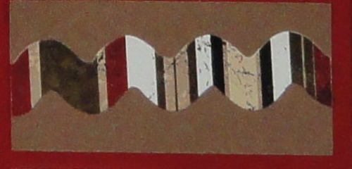
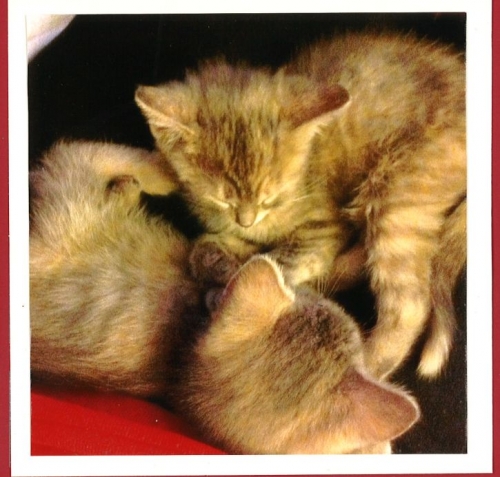 When we first got this challenge using the BRICK grid paper, I thought "oh good, red...romance and love" and I love black, white and red. But then, I started looking at my pictures, and nothing jumped out at me. A few days later, I fell in love....with the "twins"! I ended up with two new kitties that Joe and I both adore!! I started taking pictures, got them printed, and got out my black and white tiles. Again, nothing really jumped out at me. So, I started looking through my myriad of supplies for something that struck me and I found the saying below:
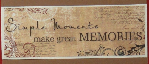
...and the red with the tan and brown colors DID hit me!! I got out the new packs of ivory and brown tiles from our quarterly supplies, and off to work I went!
I started by cutting my photos to 2/8 (two spaces on the grid!) smaller than the areas on the layout. I cut them out on one mat, then layed them out in the layout pattern (number 37) on a second mat. 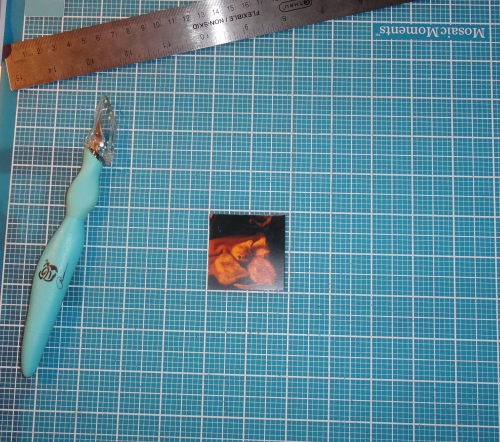
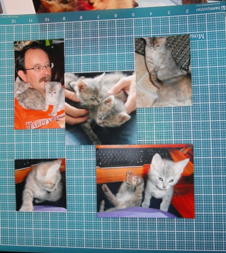
I next mounted my photos on the carob cream tiles. I stamped paw prints on one inch ivory and carob cream tiles,

mounted my last photo on the ivory, and finished up with the words and embellishments. I used the ivory date cornerstone over the carob cream  and the words are cut from a large ivory tile, using my Cricut Storybook font. The phrase and little colored strip are from Bo Bunny's "Timepiece" sticker sheet, again mounted on the carob cream.
  Page two of the layout is the mirror image of page one....I almost always do two page layouts.
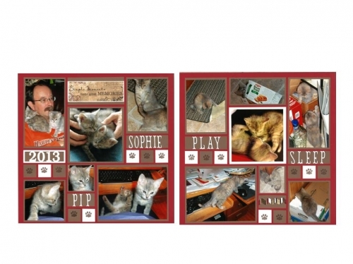
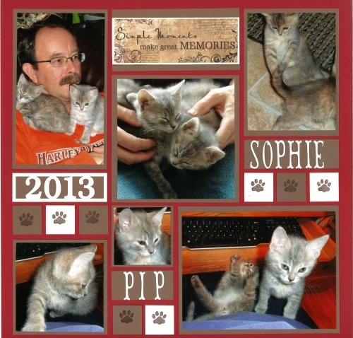
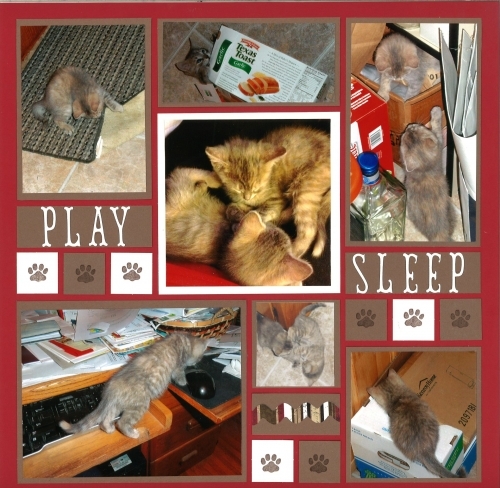
I really love the way the browns worked with the brick grid paper and brought out the colors of my "new babies"!


