Sign In or Create New Account

Remember me

Connect

The Story Board
Previous
Next
Sort Stories
Top Stories Most Recent
  |   Stories Main View   |   Stories I follow   |   Stories I've Shared   |   Favorite Stories   
 Title 
Title Author Description

Easter Baskets 2012

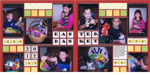
For this challenge we were to use page pattern 37 and brick grid paper.  In looking through my photos, these pictures of the grandkids from last Easter looked like they would work. I love the facial expressions in some of these pictures!
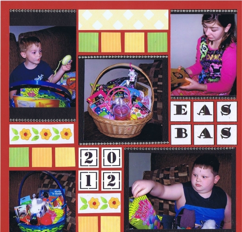
I duplicated the page pattern, using a mirror image on the right side, so that I could use the center squares for my title. 
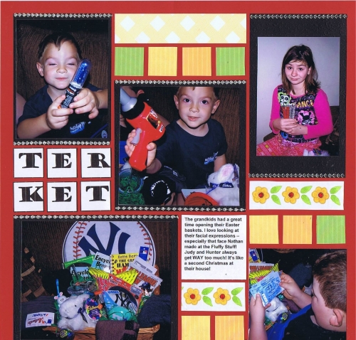
I used a couple of different free downloads available on Snap 'n Crop:  FreeDL4 (the flowers) and FLDListBlocks (the yellow and green squares). Interestingly, my printer was acting up and making streaks, so my squares ended up striped, which was okay!  I found a coordinating patterned paper in my Anna Griffin stash that had a basketweave - perfect!! I used a 2012 cornerstone, and then finished up with some blingy strips. 
 

Shared by Nancy Sanders on February 4, 2013 | Memory Date: April 8, 2012
Follow Nancy Sanders
Cheer Me On
Love it ! 3
LOL! 0
Heartwarming! 0
Yummy! 1
Great Job! 0
Wow! 0
Beautiful! 0
Thnx 4 Sharing 1
Made Me Smile 0
Click an Expression to Cheer Me On.
Story Cheered By:
Comments
I love the expressions in your photos- those are the best! I especially love the way the kiddo is looking at the "fluffy stuff." Too Sweet!!!
Posted By: Billi Glenn  |  February 10, 2013 at 11:30 pm   
It works together well. I like the way you carried your title across the two pages as well as the flow in your storytelling. Your granddaughter's facial expressions speak volumes. What a fun time.
Posted By: Diane Cook  |  February 9, 2013 at 1:43 pm   
Your photos are so good! And I too LOVE the expressions! Nice use of the letter tiles in the one inch squares for the title. I agree with Andrea...it really brings the pages together. Really nice job!
Posted By: Lori Hanson  |  February 9, 2013 at 3:29 am   
Thank you for sharing a great layout. I like the pattern #37 and you did a great job bringing in the Easter colors on a something as Tami said thinking "outside the basket." (I was going to say, "outside the grid" but I like basket better!) Love the grandchildren's expression, too. Great job.
Posted By: Janet Shetley  |  February 8, 2013 at 8:52 pm   
Very cute kids and you can tell they are having fun. Great layout with nice touches.
Posted By: Libby Wiers  |  February 8, 2013 at 4:21 pm   
Capturing "the Look" is always the goal, right? Job Done!! A colorful layout and great photos. Having your title straddle both pages is a nice way to draw them together.
Posted By: Andrea Fisher  |  February 6, 2013 at 6:31 pm   
Amazing how changing the background colors make it look so different. Cute pics - love Easter and candy :)
Posted By: Julie Oconnor  |  February 5, 2013 at 11:37 pm   
Ditto the expression comment from Candy. I love the "fluffy stuff" face! You used unexpected colors for Easter - nice to see thinking "outside the basket." :)
Posted By: Tami Potter  |  February 4, 2013 at 8:42 pm   
you are right ... the expressions are priceless!
Posted By: Candy Spiegel  |  February 4, 2013 at 6:44 pm   
     

Terms of Use | Privacy Policy | Contact Us © 2024 Journella LLC

Help us Grow on Delisous Find us on Facebook Follow us on Twitter