Sign In or Create New Account

Remember me

Connect

The Story Board
Previous
Next
Sort Stories
Top Stories Most Recent
  |   Stories Main View   |   Stories I follow   |   Stories I've Shared   |   Favorite Stories   
 Title 
Title Author Description

FOREVER


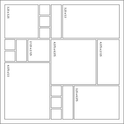
Ok, now I have my brain straight, here is my MMDT assignment #3 using brick grid paper, page pattern #37 seven spot puzzle pattern, paper tiles in creme and  free LOVE download 2009. The photos are from a December wedding I attended. Lee is a coworker RN who loves horses. She even got married in her cowboy boots! Wish I could have got a good picture of that.

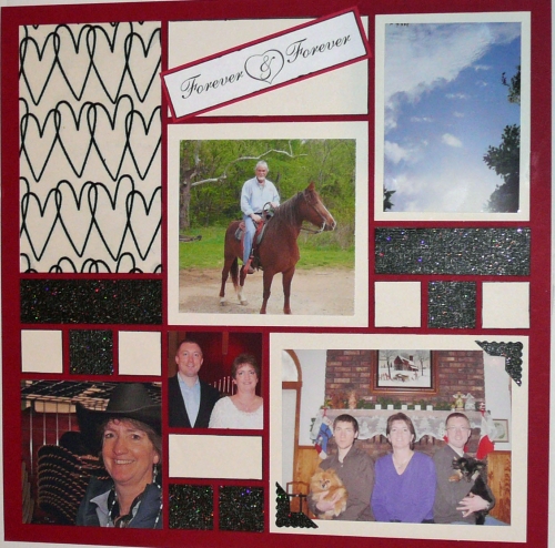
On page one I used the page pattern as shown. The photos are of Lee and Michael, Lee's two sons and her babies (dogs) and one of her horses. Also used a transparency with flocked hearts by Fancy Pants "Be You Flocked" and Black Tie Paper from Coredinations.com

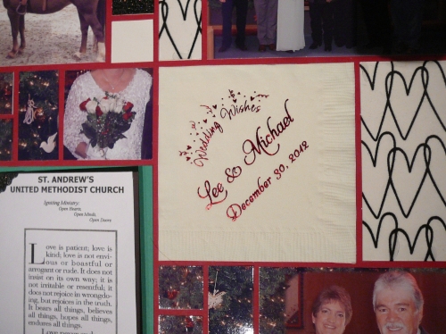
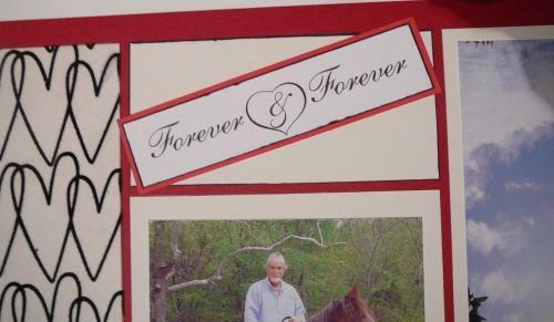
On page two I flipped the page pattern #37 on it's side to accomodate the wedding program and napkin from their special day. In addition to using paper tiles and free download LOVE 2009 from SnapnCrop.com I added transparency with flocked hearts by Fancy Pants "Be You Flocked" and Black Tie Cardstock from Coredinations.com. Used Beacons 3in1 glue for transparency. Corner punch from fiscars.
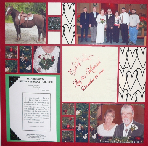


A special thanks to Lee and Michael for sharing their special day. Hope you enjoy! Julie

Shared by Julie Oconnor on February 3, 2013 | Memory Date: February 3, 2013
Follow Julie Oconnor
Cheer Me On
Love it ! 4
LOL! 0
Heartwarming! 1
Yummy! 0
Great Job! 0
Wow! 0
Beautiful! 0
Thnx 4 Sharing 0
Made Me Smile 0
Click an Expression to Cheer Me On.
Story Cheered By:
Comments
I agree with Lori...love how you incorporated the napkin and program, love the special photos and I think the sparkly black ties everything together nicely! Beautiful job and congratulations to the happy couple!
Posted By: Heather Cartland  |  February 9, 2013 at 1:40 am   
Your flocked heart paper on both pages is a nice way to draw all the elements of the wedding day together. I love the cream tiles and black sparkle paper for a formal but casual feel. What a nice way to remember this special day!
Posted By: Andrea Fisher  |  February 6, 2013 at 5:53 pm   
Great job - I like how you turned the pattern on its side! What a special wedding....
Posted By: Nancy Sanders  |  February 4, 2013 at 1:57 pm   
Ohh! I have a great pic of cowboy boots, and you are in it as well....lol
Posted By: Deemahn  |  February 4, 2013 at 1:39 am   
I love the picture of the clear sky and horse, I LOVE horses!!! Very Nice job on this layout. I love how you turned the page around to meet your needs. You did an excellent job getting all of the information from the wedding into your layout! Great job!
Posted By: Shannon Nixson  |  February 3, 2013 at 8:57 pm   
Nice job, Julie! I agree with Dale...the horse photo is special. Incorporating the memorabilia into the layout is a great touch, and makes the layout even more special. I like the hearts transparency, and the photo corners out of the same card stock as the tiles added just the right touch!
Posted By: Lori Hanson  |  February 3, 2013 at 7:01 pm   
Julie - I like the way you honored your bride and groom with this layout. You incorporated the horse which is very special to them. The photo with the blue sky shows they have a lovely day. I really like the glitter tiles you used to fill in. The black hearts give a lightness to the layout. I really like this.
Posted By: Dale Hill  |  February 3, 2013 at 6:47 pm   
Wow!!! I love the paper you used as well as the photos. You did an awesome job using the layout to showcase your photos.
Posted By: Billi Glenn  |  February 3, 2013 at 6:23 pm   
     

Terms of Use | Privacy Policy | Contact Us © 2024 Journella LLC

Help us Grow on Delisous Find us on Facebook Follow us on Twitter