Sign In or Create New Account

Remember me

Connect

The Story Board
Previous
Next
Sort Stories
Top Stories Most Recent
  |   Stories Main View   |   Stories I follow   |   Stories I've Shared   |   Favorite Stories   
 Title 
Title Author Description

Longwood Gardens

Longwood Gardens in Pennsylvania is a the most beautiful place to visit for a day. There are flower gardens, an indoor atrium with lovely rooms of all kinds of flowers, a fountain show and sometimes there is a fireworks display that is accompanied by an orchestra while the fountains are spraying.

My inspiration for taking these photos came from taking one of Tami's classes. The photos given to us for the project during the class was of beautiful flowers and I decided to go out and shoot every beautiful flower I could find. My friend Donna and I planned a field trip to Longwood Gardens to get the best floral photos we could and incorporate them into our page layouts. Although it rained that day, we were able to visit the inside gardens in the conservatory. It seemed like we walked for miles, but I don't think the conservatory is THAT big!  I have never seen such gorgeous flowers and arrangements of different kinds of flowers. They have rooms with waterfalls, roses, irises, etc. I could go on and on about all the types of flowers there.

Our 3rd photo challenge is on Brick Mosaic Moments grid paper. I chose the cornerstone (date) for my element on this page. This two page layout is done on page pattern #37. I reversed the page pattern for the second page to compliment the first page.

Page One of Layout
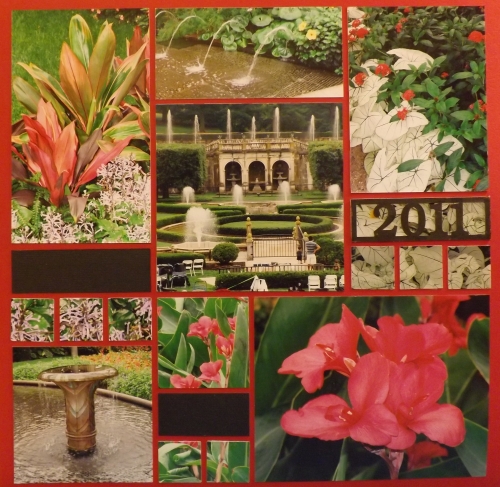
 

Page Two of Layout.
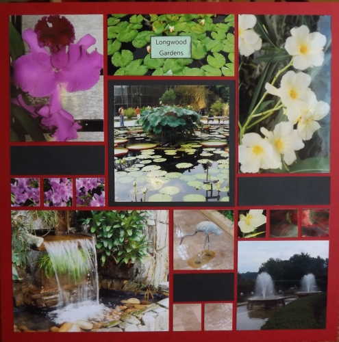

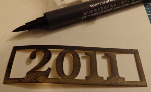
The cornerstone that I used on page one was a mustard yellow over a white paper tile. I wanted to bring in black as my accent color. So I tried to ink it, but you can see in the photo below the color was not even. So I used a marker to change it to black and then I placed it over a tile that I cut out of one of my photos. I think it gives depth to the cornerstone. I really like this technique. I saw this in one of Tami's pages in her book Designing Photo Mosaics and More on page 55. If you have the book, check it out.

Cornerstones
 

The title for this layout is Longwood Gardens I printed the tile on white card stock and inked the edges. I then mounted the title over a photo of water lilies.

Photo mosaics

The photo in the upper right hand side of the page is cut into five pieces. The top photo is the main photo. The next one underneath is the tile with the cornerstone date on top of it  below that I cut one inch squares out of another part of the photo. I did the same technique with all three main photos and the 2 inch square in the middle at the bottom. 
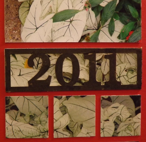

In this photo you can see that I cut the photo into three sections and placed the black accent tile in between the bottom two tiles and the main photo.
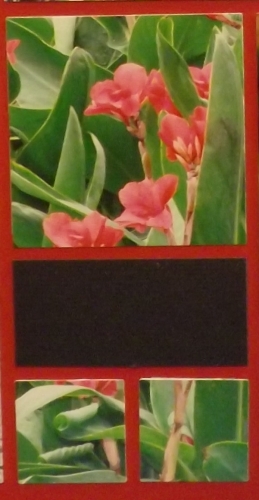

Architecture

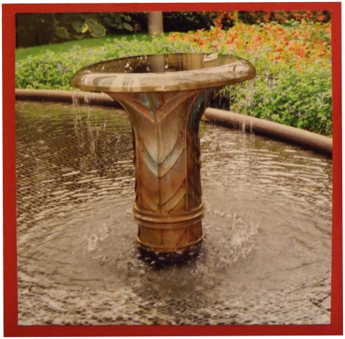
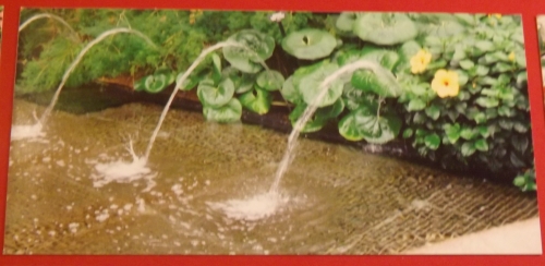
There are some very pretty and interesting architectural elements at the gardens. Inside there is a fountain set alongside a carpet of greenery and flowers. It looks like a bronze metallic. There is another area in the building that has a garden bordering tile pavement with gentle spurts of water flowing from inside the garden. Here are two examples of the different architectural features. Close ups of these are below.


Water features
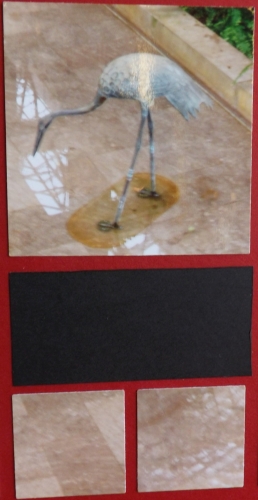
Here is a metal bird in the atrium. For the bottom two tiles, I used the bottom of the photo to cut my tiles.

If you are ever in Pennsylvania, make this part of your itinerary. You will be in photo heaven as I was.


Shared by Dale Hill on February 3, 2013 | Memory Date: February 3, 2013
Follow Dale Hill
Cheer Me On
Love it ! 6
LOL! 0
Heartwarming! 0
Yummy! 0
Great Job! 0
Wow! 0
Beautiful! 1
Thnx 4 Sharing 0
Made Me Smile 0
Click an Expression to Cheer Me On.
Story Cheered By:
Comments
Those are absolutely beautiful photos and an equally beautiful layout. I love the way you used the cornerstone over a photo as well. Great job!
Posted By: Billi Glenn  |  February 10, 2013 at 11:28 pm   
Absolutely beautiful!! The first layout I ever did using Mosaic Moments was with photos from a botanical garden. They are so perfect for these layouts, and your photos are gorgeous! Love the black with the brick and I also love the date cornerstone over those beautiful white leaves! Fantastic job!!
Posted By: Heather Cartland  |  February 9, 2013 at 1:26 am   
Just love this layout! I love gardens and have photos of several that need scrapping (including some of my husband and son's effort at home). Hope I do as well as this!
Posted By: Libby Wiers  |  February 7, 2013 at 4:00 pm   
The lush greens and pops of color fairly fills out this page pattern! It is spectacular! Love the layered date tile. Great detail shots and close-ups, and a wonderful story you have told too! Top-notch presentation, Dale, well done!
Posted By: Andrea Fisher  |  February 6, 2013 at 6:21 pm   
Love the effect of the Year CornerStone over the photo. The black is a wonderful accent color on the brick grid. Longwood Gardens is one of my absolute favorite gardens. I've only been in the summer. I hope to return to see it in another season - spring or may be fall! Your photos are beautiful!
Posted By: Tami Potter  |  February 4, 2013 at 8:36 pm   
Beautiful photos! I'll have to put this on my list of places to visit! Great job...
Posted By: Nancy Sanders  |  February 4, 2013 at 1:55 pm   
Dale! I absolutley LOVE your pages. Flowers make such pretty layouts! The colors are so vibrant and pretty. Very clever with putting the coner stone over a picture, nice, nice idea-I love that! May have to scraplift it!!! :)
Posted By: Shannon Nixson  |  February 3, 2013 at 9:01 pm   
Love, love , love this! As I read the posts, I see how much many of us have in common! Since taking that first class with Tami way back when, with the flower photos, I too take many flower photos...as evidenced in my original submissions! And, like you, I use the book for inspiration all of the time! When I get mine posted, you'll see what I mean! Anyway, your layout is beautiful. I love how you put the date tile over the photo, and how you used parts of the photo for the 1" squares. Very nice job, Dale!
Posted By: Lori Hanson  |  February 3, 2013 at 6:47 pm   
Just beautiful! Great photos and really like to cornerstone you altered and placed over a photo. Nice idea. Looks like a great place to visit. We got some snow last night :/
Posted By: Julie Oconnor  |  February 3, 2013 at 6:47 pm   
     

Terms of Use | Privacy Policy | Contact Us © 2024 Journella LLC

Help us Grow on Delisous Find us on Facebook Follow us on Twitter