2013 Design Team Challenge #2: The Cat in the Hat
Hi All!
Thank you for stopping by to see my work. For the second challenge, we had to use Dr. Seuss as inspiration and use 1" as a design element. I was soo excited when I first read this challenge so many ideas ran through my mind. I love Dr. Seuss and the way he used words, reading and rhymes and there was always a lesson involved! To me, he was genius. So, I began with my pictures and all of my goodies and boom-nothing! It just got overwhelming for me. So, I had to step away, regroup, clear my mind and come at it again.
So, after a few days, a second set of pictures, seasons 1-7 of Matlock and a fresh set of ideas-I went to work!!!!
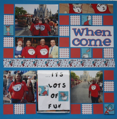
I used bahama blue grid paper, red and red/white polka dot accent paper. I also used cut outs from Dr. Seuss scrapbooking paper that I lucked up and found! I thought these colors went well with the colors from the story.
I had to work through having so many pictures for 1 outing and getting most of them onto a page. So I began by figuring out how I was going to get them onto my layout.
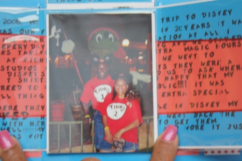
I used this photo fold out (I bought from a Scrapbooking Convention) that I taped down to the page and added 4 pictures and some journaling.
This allowed me to place more pictures from the same event on the page.
Here is the left side of the layout:

I cut the page protector using an exacto knife, cutting mat and ruler.
to be able to open the fold out and see all of the pictures and journaling inside:

I journaled across the middle complete with Dr. Seuss font!!! and the picture of the dogs are on the other side of the flap where the picture of my husband and I are (pictured above). All of the flaps fold toward the center and magnets (hidden under the photos) holds it all together.
The title of the layout is: When Things Come Together... It's a lot of fun Especially dressed as thing 2 and Thing 1! You have to open the flap the see "especially dressed as thing 2nd ans thing 1".
Here is the right side of the layout:
So here is the whole layout together. I hope you enjoy
On the right side under the quote from Dr. Seuss are 8 additional photos!!!
Another way I was able to get one more picture on the page is, I cut 2 pictures to the same size (3x3), I taped 1 picture to the page:
Up in the left corner I used a Crop-A-Dile to make a hole in the same place on both pictures and then I used a brad to hold it in place, but still able to move. I cut that same size in the page protector to be able to move the top picture to see the photo underneath.
If you made it here-I appreciate you taking your time to look at and read about my work. I'm normally not this lengthy, (I'm a hit it and quit it gal) but I wanted to show you the fun, whimsical ways (I think) to get more photos on a page.
Just because you are still with me, here is the full layout again!!!!
Thank you again for stopping by, hopefully, it wasn't too painful for you!!!!
Have a great day! :)
Shann


