Sign In or Create New Account

Remember me

Connect

The Story Board
Previous
Next
Sort Stories
Top Stories Most Recent
  |   Stories Main View   |   Stories I follow   |   Stories I've Shared   |   Favorite Stories   
 Title 
Title Author Description

Inspired by Dr. Seuss -- MMDT Challenge #2
It took me a while to find my inspiration for this week's challenge : a layout inspired by a Dr. Seuss book.

My first thought was "Green Eggs & Ham." I once read that you could change the color of a chicken's egg yolk if you gave them food coloring and I thought it would be fun to see if it really works.

But then I decided not to torture my chickens, so I chose "And To Think That I Saw It On Mulberry Street."

I thought it would be fun to take pictures along "Main Street" in my hometown. But, since I live in such a small town (the speed limit remains 45 mph through the community). I decided to go the neighboring town of Fenton (where we do our shopping and dining) for pictures.

Here in Michigan it is cold this time of year and Fenton is not the type of town people walk around in, but I thought I could find some interesting photos anyway.

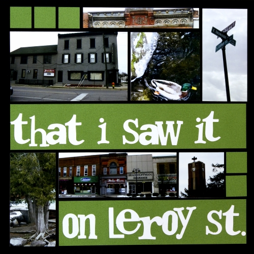
So began, "And To Think That I Saw It On LeRoy Street."

At first I enjoyed my trip to the downtown area. We started at the candy shop on the corner where I picked up a bag of candy fruit slices. I took pictures of churches, the dam, ducks in the river and a few other buildings. But, by the time I started taking photos of the few remaining historic buildings in the city, anger had consumed me.

During the 1970s, the government offered an urban renewal plan and Fenton took advantage of it. Blocks and blocks of beautiful 1800s-era buildings were demolished in the name of progress. Many businesses closed during this time, since the buildings they operated in were slated for demolition. When all was said and done, only three blocks remained -- none of them next to each other. The town has been "renewed" with ugly strip malls and parking lots.

A few decades later, Fenton finally realized the horrible error they made and had the few remaining buildings listed on the historic register. They boast their historic buildings online and on flags around town. In fact, I even found a line on the city's website that says Fenton looks much the same as it did way back then! The fact that they flaunt their historic buildings when they ripped down three-quarters of them just infuriates me.

As I was taking a photo of some of the unique architecture in one of the buildings, this all came rushing back to me. My heart started pounding, my face got red and I was mad enough to stomp my feet and yell at those horrible council members who razed much of the town.

Thinking this lighthearted layout was a mistake, I remembered that Dr. Seuss often had underlying political messages in his stories. So, my plan took a bit of a turn and I decided to incorporate the dark side of Fenton into my design.

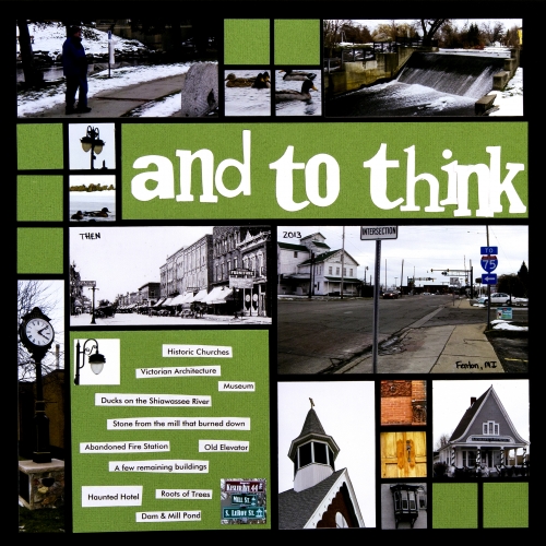
So here is "And To Think That I Saw It On LeRoy Street," along with a bit of what I should have seen on LeRoy Street.
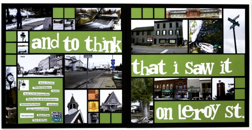
I used black Mosaic Moments paper and green cardstock. I added a bit of cardstock around the edges to help create a border on the page.

I used the die Word Play by Tim Holtz/Sizzix to cut out the letters. They are whimsical like most Dr. Seuss books, so I thought they would work well. 

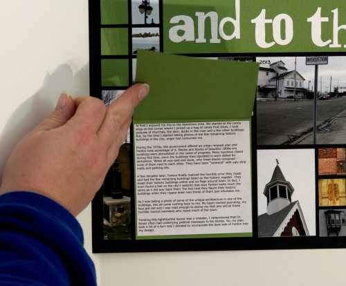
For the journaling, I made a little flip folder with cardstock. The inside explains what I wrote above. On the outside I included a few extra photos and words that describe the specific things in each of the photos: a haunted hotel, historic churches, Victorian architecture, ducks on the river, the roots of trees, the dam and mill pond, etc.
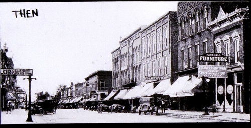
I included one old photo from the Fenton Historical Society to show what the street once looked like. The rest of the photos were all taken on a single afternoon.
Shared by Candy Spiegel on January 11, 2013 | Memory Date: January 15, 2013
Follow Candy Spiegel
Cheer Me On
Love it ! 2
LOL! 0
Heartwarming! 0
Yummy! 0
Great Job! 0
Wow! 3
Beautiful! 0
Thnx 4 Sharing 3
Made Me Smile 0
Click an Expression to Cheer Me On.
Story Cheered By:
Comments
The layout really shows your emotions and I think your choice of green and black add to that feeling. Your point was well made. Great photos. Isn't it interesting that you might not have taken those photos of Fenton if not for this challenge.
Posted By: Dale Hill  |  January 26, 2013 at 12:58 am   
Wonderful layout. Though it's a sad, tough subject, what a great way to vent. Your colors are perfect for this. This layout will hopefully be a part of you, and your family's, history. Super well done!
Posted By: Lori Hanson  |  January 22, 2013 at 2:26 am   
This story is an eye opener. Thank you for sharing. I enjoyed reading everyhting about Fenton that you shared. History is rich! I love the colors, it all goes with the storyline. Very well done.
Posted By: Shannon Nixson  |  January 20, 2013 at 7:44 pm   
What a beautiful before picture. Thanks for a different Dr Suess view point. Great way to share thisl
Posted By: Julie Oconnor  |  January 20, 2013 at 5:40 pm   
This type of story makes me sad and angry as well. I do also love the antique buildings and architecture of those tiny forgotten towns. And when they are "improved" like this, it makes me sick. It reminds me to enjoy the towns I visit that have not been renewed and take in their nostalgic beauty. I'll be visiting one such town next weekend in MI. I'll be in the Manchester/Chelsea area on a scrapbook weekend with some friends! I'll remember to take photos of the old towns :) Great job!
Posted By: Heather Cartland  |  January 18, 2013 at 6:39 pm   
The layout is wonderfully well done, in spite of the slightly darker topic. Urban renewal wasn't a great idea around here, either, with lots of great old buildings now gone. Sad. Another Seuss book in the same vein is The Lorax, needing to save the forests...
Posted By: Libby Wiers  |  January 18, 2013 at 3:09 pm   
Very nice job, Candy, I'm glad you pursued the other side of Seuss for this presentation. The Butter Battle Book was the first I was aware of his writing in this vein. The overcast day contributes to the feel of the subject almost draining the color from "real time." Placing it on Black MM grid paper adds to the old time scrapbook feel while the vivid green punches life back into it. The size of your title emphasizes the despair you are feeling. I love the old time photo of Fenton then...what a stark contrast! I live in a town, in a county, where almost all our old buildings still stand. I, too, love the architectural details you've highlighted.I like the 1" paper tiles and the 1" photo tiles and how you have used them. Overall, I like your clean approach and how the mosaic pattern shows up so well. Your "rest of the story" writing lets us appreciate the layout so much more! Well done!
Posted By: Andrea Fisher  |  January 17, 2013 at 6:22 pm   
I love your description - the evolution for creating this layout. Unexpected emotions coming out and being recorded - that is some great stuff! Thank you for sharing it with us.
Posted By: Tami Potter  |  January 17, 2013 at 12:20 pm   
You put a lot of thought and time into building this layout. Your passion is well-earned and it shows. Actually, it's a layout that could very lightly end up in the hands of the historical society, lest we forget. Good job.
Posted By: Diane Cook  |  January 17, 2013 at 4:41 am   
The Cheering On comments should include "Sobering".
Posted By: Sandra Henson  |  January 17, 2013 at 1:56 am   
     

Terms of Use | Privacy Policy | Contact Us © 2024 Journella LLC

Help us Grow on Delisous Find us on Facebook Follow us on Twitter