Design Team Submissions


6 various layouts using Mosaic Moments techniques and papers. Enjoy!
Shared by
Lori Hanson
on October 31, 2012
| Memory Date: October 30, 2012
Cheer Me On
Story Cheered By:
Comments
Thank you both!! :)
I absolutely LOVE this technique!
Posted By:
Lori Hanson | November 2, 2012 at 9:56 pm
Absolutely gorgeous! Aren't garden photos the most fun to do with Mosaic Moments? Love all of these layouts!
Posted By:
Heather Cartland | November 2, 2012 at 4:09 pm
Lori, Great presentation..your photos show up very nicely, looks like you have mastered that first hurdle well...share your tips!
#1 Discover-great title, love the color combos with the photos!
#2 Like the variations in cuts and the focal photo with the palm trees.
#3 Almost all mosaics page with mostly pink flowers in varying details really adds interest to the layout.
#4 Beautiful photos in page pattern #50,it works so well!
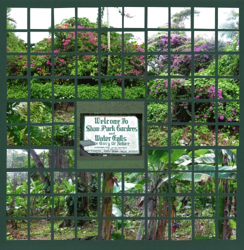
#5 Nice garden layout...looks great on the green grid, blending in rather than contrast.
#6 Tropical paradise! Using the same cut pattern on the top three rows and bottom three rows is a nice effect. Making the palm trees from the bottom bump up into the mosaic center is a nice touch.
Thanks for sharing your submissons for the 2013 MMDT.
Posted By:
Andrea Fisher | October 31, 2012 at 6:07 am


