2012 MMDT October Photo Challenge #1: Signs of Autumn
Signs of Autumn
My favorite season is fall. Coming up with a look at all the things that are distinctly signs of autumn was a fun endeavor. Even the trees co-operated with an early show of color. We've had cool evenings and warm days, a perfect fall and perfect for being inspired. I hoped to capture the vivid colors that are unique to the season.
I happened to pick up a few papers at my local scrapbook store that I thought would be fun to use, and a few embellishments too. I kept the extras to a minimum, but hope that it's just enough.
Page 1
and the close ups from this page:
using a terra cotta leaf cornerstone, edges brushed with Rousillon Color Box pigment, changed the white background to a sand colored MM paper tiles. Stamped the sand tile in Versa Magic's Dew Drop Chalk: Jumbo Java using Tami's Autumn Seals Stamps from Impression Obsession (CL108) I also used the same stamp with Versa Magic's Dew Drop Chalk: Wheat for a tone on tone look. Done right it should match up with the words on the leaf, if not use the second side to get it right...like I had to!! Patterned paper is Autumn Harvest by Reminisce.
The Cornerstones FALL and 2012 have been used without the background tiles so that this gorgeous shade of Cocoa 12x12 MM Grid Paper would show through. Fall was in Sunflower and the year in White. Using a color misting technique that Tami shared on her blog a few weeks back I decided to color the white tiles with Tattered Angels shimmering mists. However the sunflower then looked a little bland...so more spraying. This shot doesn't show up the glimmer as much as in real life, but it will let you see the speckled effect. Tattered Angels Colors used Candy Apple Red, Gold, Peach Delight and Olive Vine.
Above is the caramel apple mixture for my birthday cheesecake that Hannah made for me!!! Also an old apple press for making cider.
Page 2
Add-ons here are a couple of leaves, a button and raffia. The rust colored leaf was run through D'Vine Swirls embossing folder and brushed some Dew Drop Brilliance colors: Pearlescent Poppy and Pearlescent Rust and Galaxy Gold. The brown leaf is actually a very interesting item found at Hobby Lobby by The Paper Studio. It is Tea Stained Leather. It was a bear to punch through with EK Success Paper Shapers Maple Leaf punch and some of the edges were exposed so the Jumbo Java Versa Magic chalk on the edges covered the problem and gave some depth to the leaf. The texture from the paper...Love it!! Will use this paper again!!!
page 2 close up
For the small 1" squares at the bottom I had several 2x2 squares that were intended to be used before I changed the layout pattern. The 1" punch took bits out of several squares to create this colorful fall border.
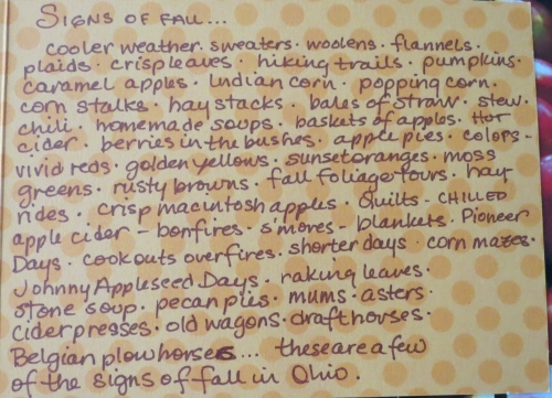
The Indian Corn, the weird shaped gourds and squashes, and the multi-colored mums...all are examples of a beautiful fall palette.
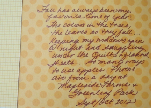
For the journaling a Doodlebug Tangerine Polka Dot Card was used and a Sharpie Ultra Fine Brown marker was used for the hand-lettering. A technique used in an earlier challenge has been used here as well, adapted for the card flap. In order to read the journaling while your page is in a page protector a cut has been made in the page protector.
Here's how:
option one: Line up your metal ruler on the edge of your card and carefully use your exacto knife to pierce the protector, but do not touch your photo below. Or...
option two: place the ruler tightly against the card fold and gently pierce the protector and keep it from touching the photo below. The metal ruler in this position creates enough tension to make this cut easily, but if you do not make a clean cut, hold both edges of the protector away from the layout while you guide the knife along the cut line to separate the sides. (see below)
Insert your page and bow the page so you can slide the front flap of the card through the cut, it's perfect for protecting a photo that you may have inside, in this case...it's just my journaling.


One of the embellishments was the pumpkin from a set by Bo-Bunny. Letters from Doodlebug Design inc. "all mixed up" tangerine small rub-ons were chosen for the title, but needed something for them to show up on as they were so light in color, and small. Had a brainstorm. Decided to use the filler in the embellishments and cut to the size needed. Waste not, want not.
Well, that's the October challenge, and a few tips on "how-to".
If you are visiting Journella today you still have time before the deadline for applications to the new 2013 Design Team. Come on, you know you'd like to try it out...show us what you've got!
Thanks for stopping by...
andrea


