Sign In or Create New Account

Remember me

Connect

The Story Board
Previous
Next
Sort Stories
Top Stories Most Recent
  |   Stories Main View   |   Stories I follow   |   Stories I've Shared   |   Favorite Stories   
 Title 
Title Author Description

Parrot Mountain

    We just returned from a vacation to Pigeon Forge and Gatlinburg last week.  We took a 1-hour free camera class at our resort and learned more than we did in three courses at the local college.  We spent lots of time trying out our new skills.  One tip from the instructor was to take lots of pictures, so we have much more to choose from than in the past.

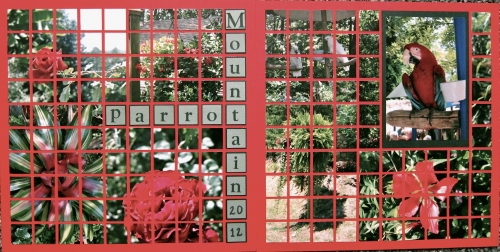
     We went to Parrot Mountain to see the birds, but we were also treated to a wide array of flowers and greenery.  It was such a beautiful, peaceful place, and we enjoyed it immensely.

     Our challenge this time was to use scarlet grid paper and create a page using only 1" squares.  I decided to add a companion page, because I didn't want to cut up the picture of the parrot which is the focal point of the  two-page outlet.  I matted it with dark green.

     Hopefully, the colors show at least close to the originals.  I didn't journal yet, but I will on another page showing more of the birds and flowers.  The title is 1" squares of dark green topped with 7/8" squares of light green.  the letters are dark green.  There were so many different types of green in the pictures that it was hard to match, but I was satisfied with the overall look.  Sorry I couldn't get these to load in the right order, but I think you can get the idea.  The first one is actually page 2.
Shared by Linda Holmes on September 18, 2012 | Memory Date: September 18, 2012
Follow Linda Holmes
Cheer Me On
Love it ! 8
LOL! 0
Heartwarming! 0
Yummy! 0
Great Job! 0
Wow! 0
Beautiful! 2
Thnx 4 Sharing 0
Made Me Smile 0
Click an Expression to Cheer Me On.
Story Cheered By:
Comments
Very Nice Layout! The colors are beautiful.
Posted By: Shannon Nixson  |  December 13, 2012 at 2:37 am   
You were right not to cut the parrot. The flowers are gorgeous! I love the layout!
Posted By: Georgia Bizal  |  October 4, 2012 at 1:55 am   
Beautiful! I love those closeups of the flowers....
Posted By: Nancy Sanders  |  October 2, 2012 at 10:17 pm   
I have been taking a few photography classes, too. My instructor says that for every picture you see in Nat'l Geographic, there are 500 (or more) on the cutting room floor so don't be afraid to take two pics that "seem" the same because the slightest change of angle, lighting, etc. could make the difference between good and great. Looks like you've got it - these pics are GREAT!!! Love the layout!
Posted By: Deborah White  |  October 2, 2012 at 2:51 pm   
Beautiful birds and pages!
Posted By: Julie Oconnor  |  September 27, 2012 at 1:58 am   
Great pictures that make a beautiful page!!
Posted By: Beth Glass  |  September 21, 2012 at 5:12 pm   
Beautiful as usual. Looks like the photography lessons were worth it. The pictures are stunning.
Posted By: Martha Klein  |  September 21, 2012 at 3:51 pm   
Your pictures portray a place of serenity and beauty. I'm sure it was a wonderful trip. Good job!
Posted By: Rose Van Cleave  |  September 20, 2012 at 5:35 am   
In all our trips to the Smokies, I have not been to Parrot Mountain, but it looks like a very colorful stop. The flowers are a wonderful complement to the scarlet page and the green balances things off nicely. The Parrot is a very nice feature, stunning plumage! Great job, Linda!!
Posted By: Andrea Fisher  |  September 19, 2012 at 3:19 pm   
The flowers are gorgeous and that is such a nice shot of the parrot!
Posted By: Tami Potter  |  September 18, 2012 at 1:48 pm   
     

Terms of Use | Privacy Policy | Contact Us © 2024 Journella LLC

Help us Grow on Delisous Find us on Facebook Follow us on Twitter