Sea Life Park - Hawaii
For the first project of March, we were to use the techniques of photo bleed and overlapping photos, and incorporate burlap, fabric, or felt.
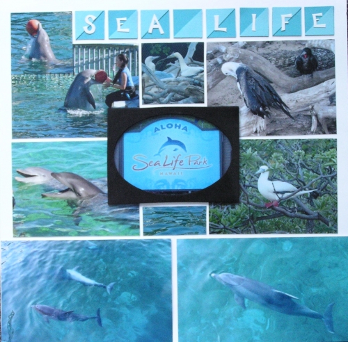
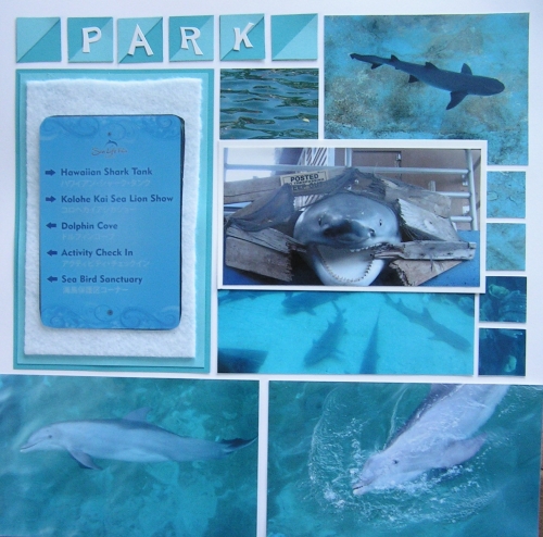
I decided that some of my photos from Sea Life Park would be great for the photo bleed (to the edge of the page). I used 4 photos of the dolphins swimming to line the bottom of both pages....kind of looks like they are swimming across the page!
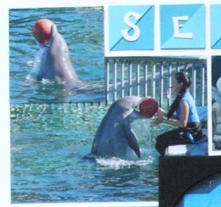
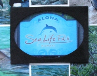
I used the overlap technique on both sides...first in the upper left corner of page 1 with the dolphin and the ball, then the framed photo of the park sign in the middle overlaping the 4 photos around it. This frame is made of felt, incorporating that element!
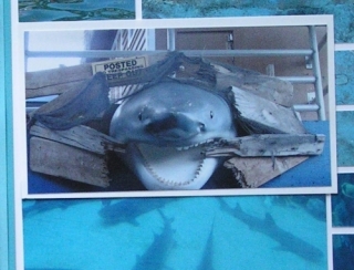
On page 2, I overlapped the photo of the shark sign with the photos of the sharks themselves.
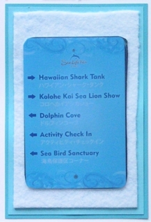
On the second page I mounted the photo of one of the signs on white felt, then layered with paper tiles. I used the directions on the sign to decide which photos to put on which side of the layout!
I used Andrea's technique of cutting the 1 inch squares in 1/2 and layering the halves on a whole! The letters are white Funky Alphabet stickers by Karen Foster.

I used white grid paper for this project, to highlight the bright colors. The paper tiles are from the trio of caribbean breeze, tropical breeze, and ocean breeze (one of my favorites!).
Here is each page closer up! Enjoy!
