Challenge # 10-2013 MMDT Monochromatic Color
Challenge #10 Photo Challenge: Inspired by Monochromatic Color
My favorite spot at the home improvement stores is the paint aisle. I love to look at the paint chips! It was also a great spot to go for some monochromatic color inspiration!
As a child I loved the many colors of Crayola crayons, but was severely limited by the box of eight or sixteen I had…I longed for the BIG box…and all those colors! Years later my love of color hasn’t diminished. It has crossed into my watercolors, markers, papers, floss and fabric!
For last year’s color challenge I chose purple and presented "Passionate for Purple." This time I thought I’d explore one of the color families that I tend to lean towards, something I'm comfortable with, blues and greens, and explore the possibilities and see more, so today I’m going to go with GREEN for this Monochromatic Color Challenge.

(The down side of going with green has been having strains of Barry McGuire with the New Christie Minstrels singing “Green, Green” constantly going through my head, and thoughts of Ireland’s Forty Shades of Green.)
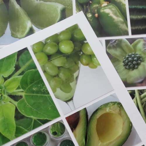
The arrival of spring (finally!) was the actual inspiration for my choice. Green was all around! There are so many shades of green; nature is full of examples in every hue, shade, tone and tint. My studio provided many items to contribute to the challenge and I found green to be one of the tastier colors as well! Think of all the foods that are green, from sweet and tangy fruits to the crisp fresh lettuces for a summer salad. The photo challenge being Monochromatic I included the hues of greens from blue-greens to the yellow-greens along with the varied shades, tones and tints of each and tried to group them together on the pages.

Color Wheel courtesy of Operation Write Home
I find it a calming, soothing color. It can also be vivid, vibrant and bold. In spring it shouts for attention in every new leaf. It frames every flower that lifts its head from the ground making it stand out and shine on its own, while quietly filling in the background. Being spring, I just had to make the most of all that’s out there. I wanted to see how many variations of color and textures could be found and bring an interesting layout together.
Green is a serene color and makes a pleasant choice for a room where you want to relax. Thinking of things green to shoot I thought of apples, kiwis, limes, grapes, avocados, watermelon rinds and mint chocolate chip ice cream! Included is a sea urchin shell, a sunflower beginning to grow, clover and a newly budded dogwood bloom. Threads, fabric and floss, Prismacolor pencils and twinkling H2O watercolors joined the collection. Even a few M&M’s and a Sprite bottle were included. I tried shooting photos from different angles and perspectives to get the looks I wanted and then cropped photos in ways to increase interest in them. The floss and H2O’s were cropped to use as smaller sections repeatedly alongside like colors.
Page One
Page Two
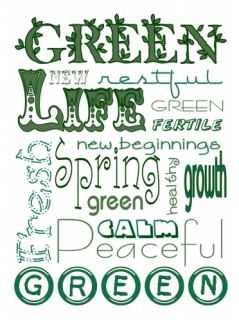
My title/journal block includes some of the words I associate with the color green. It is written on a Mosaic Moments Pear Crush Paper Tile and double mounted on Bazzill cardstocks Lime Crush and Kiwi Crush. I chose to work on White 12x12 Mosaic Moments Grid Paper. I love the way the color shows so well against the crisp clean white.

Why not pick your favorite color and see what you can do and join us in this challenge…we’d love to have you along!
Thanks for stopping by and sharing your thoughts.
andrea
STOP THE PRESSES!! My Lowe’s ad is in for the week and they now have PANTONE Colors in their paint line!!! This year’s color of the year is Emerald Green!!! Love it!! This is my other source of colors that are green…Isabella’s Pantone Color Book! Don't you love the names?


